Red is the “it” color of the season and according to a new trend, you can’t go wrong when adding it to your home, whether it is through red paint or decor and furnishings. It can be super impactful in design when used as an accent or even a bold all-over look and there is such a wide range of shades that there is bound to be one that suits your style and decor.
While it’s unclear who originally came up with this idea, deemed the “unexpected red theory,” a video by TikTok creator @intayriors recently went viral. In the video, she explains that “the unexpected red theory is basically adding anything red, big or small, to a room where it doesn’t match at all, and it automatically looks better.”
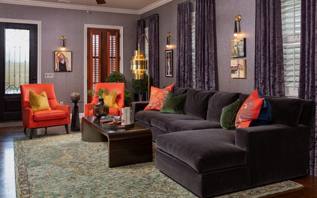
As interior designers, we are inclined to agree and have been doing this in our projects for years. Check out this space where we used a brighter shade of red on the accent chairs and throw pillows – it works because it is surrounded by more toned-down shades of purple, a surprising combination that gives the space a regal and unified feel. That’s because they are analogous colors, meaning they’re next to each other on the color wheel.
There may even be some science behind why red creates such drama in a space… it is one of the most visible colors in the color spectrum, so it automatically grabs attention and attracts your eye.
I’m Not Ready for a Bold Red – What Other Shades Can I Try?
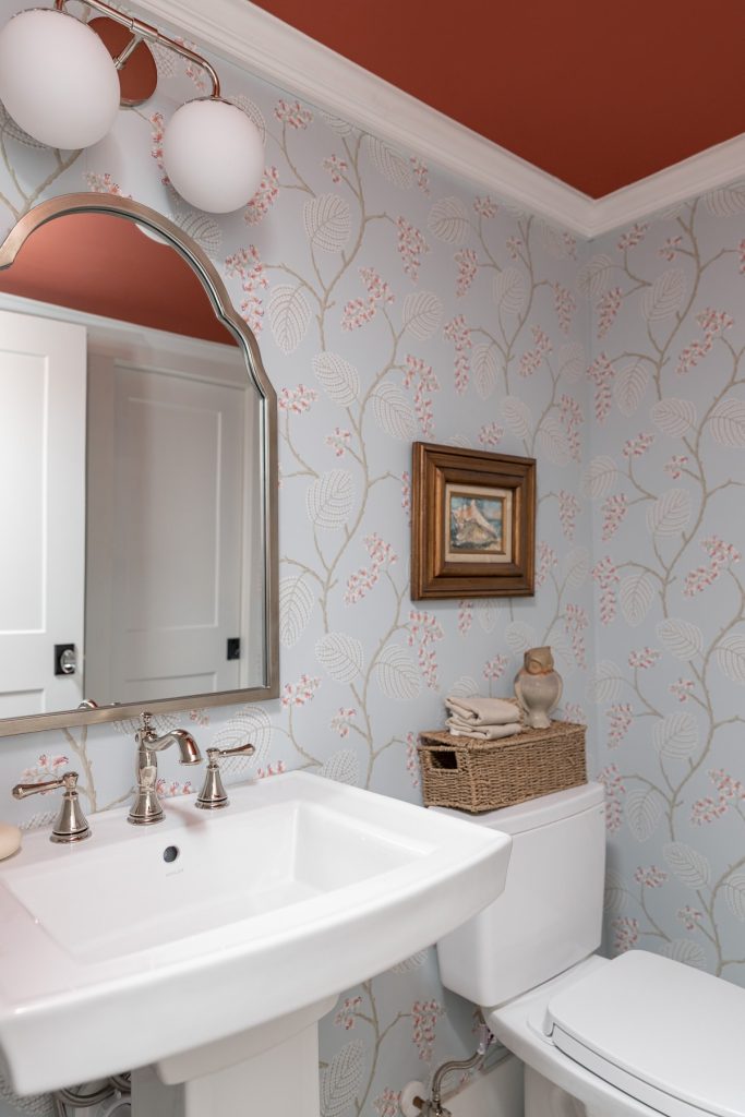
Despite its boldness, it can also work surprisingly well as a neutral. You could use a terra-cotta shade, which is warmer and more muted, especially in a room with limited natural light like this powder bathroom where we painted the ceiling Benjamin Moore – Moroccan Spice, a beautifully organic and warm shade of red paint. It pulls from the subtle hints of red in the wallcovering but is balanced by the white and soft blues in the rest of the space.
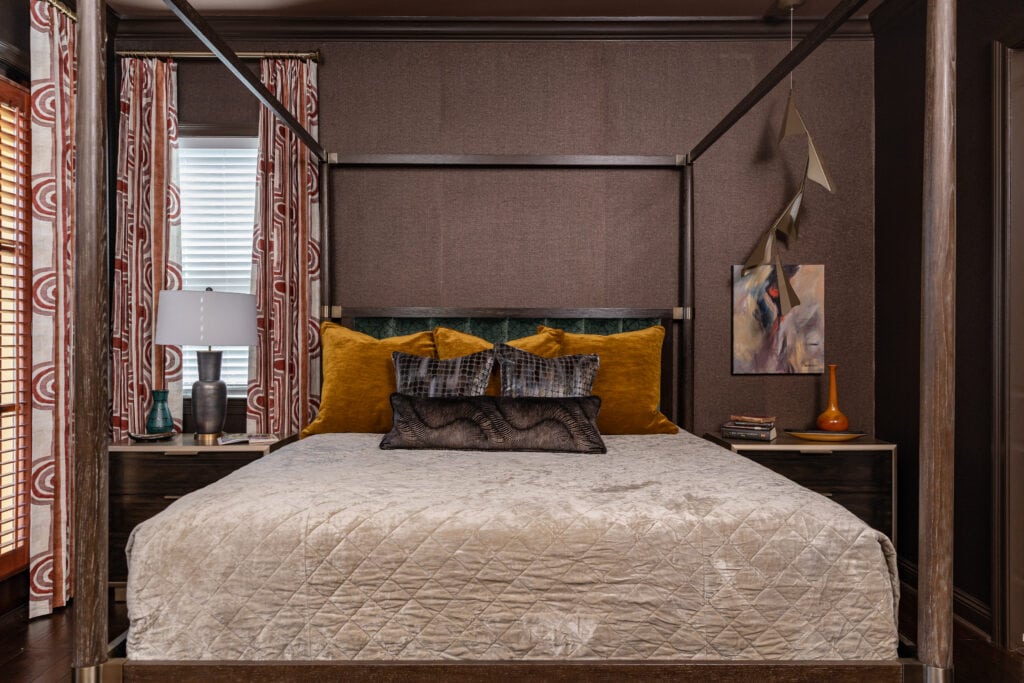
You could also use a burgundy-like hue with purple undertones or an earthier tone with hints of brown in a more traditional space with a lot of antiques or a lot of wood surfaces, like in this bedroom where we added touches of red with the curtains and art. Subtle, yet impactful.
“RED IS LIKE A PUNCTUATION MARK FOR AN OTHERWISE NEUTRAL ROOM.”
—ANDREA MAGNO, COLOR & DESIGN EXPERT
Regardless of which shade you decide on, if you do it right, it will be timeless and add just the right amount of unexpected style.
What Other Ways Can I Incorporate Red into My Space?
The nice thing about this trend is that it’s easy to try out in your space without breaking the bank. See what items you already have on hand that you can feature more prominently in your space. For example, if you have a red-toned throw blanket or pillow in storage, see what it looks like to add it to your couch—even if you think there is no way it will work! You could also work red in through your wall art, rugs, or smaller decorative accents like pottery, books, or vintage glass sets.
If you’re feeling brave, red paint can also be a great way to try out this trend. Consider painting a picture frame or doorway trim in a shade of red that you like to start. Then, if you want to take it even further, maybe paint the ceiling or even the walls!
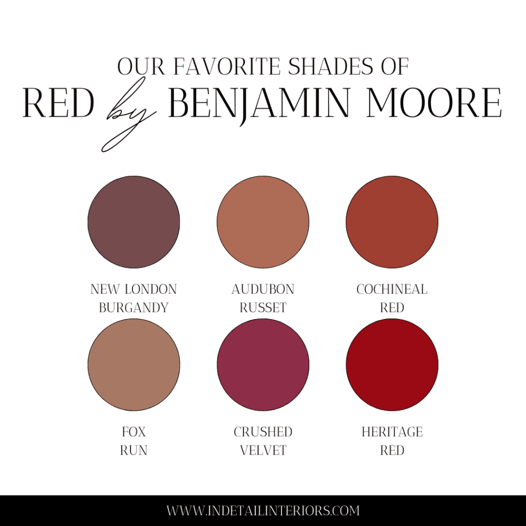
Our 6 Favorite Red Paint Colors
Need help choosing a shade of red paint? Here are our team’s six favorites from Benjamin Moore.
- Raison Torte – Rich and full of luscious flavor, this earthy burgundy lives up to its name. Its warmth and moodiness create an intimate and inviting space, which can be especially fun in smaller spaces when you want to add some visual depth!
- Audubon Russet – A charismatic medium with a terracotta twist. Beautifully warm, rich, and deep, this paint changes and moves throughout the day due to its velvety finish. It brings just the right amount of organic depth to a space.
- Cochineal Red – Grown-up and glamorous, this aristocratic deep shade was created with red pigments available in the 18th century. It’s soothing and works well for a contrast without being harsh. Its history makes it perfect for updating an heirloom piece of furniture.
- Fox Run – A rustic fusion that works well in rooms with limited natural light and packs a powerful punch yet simultaneously feels subtle. It goes with a variety of styles from traditional to modern.
- Crushed Velvet – A lush cranberry hue that brings to mind the luxurious nap of the deepest velvet. It has a little violet hue that adds a playful and fun moment in a space. Very glamorous!
- Heritage Red – A very classic shade that infuses a space with energy and personality. This has to be the sexiest shade of red. Pair it with crisp white trim, rich velvets, animal print, and spectacular art and you have a fabulous room for hosting all your parties!
