What is all the ruckus about?
Facebook is all abuzz about the new color of the year from Sherwin Williams. I hardly pay attention to these things ( well except that time I was invited to NYC for the launch of Ben Moore’s color of the year in 2016- now that was a PARTY) but today so many railed against the color choice- it made me think why?
People are missing the point
A color of the year in my opinion- is an idea to bring forth new interpretation- to get people to think of a shade in a different way- but just like in politics oh dear lord- people rush to say – no because of their PERSONAL association with a color- this coming from designers blows my mind as we are trained to look at things in ways that the general populace does not.
The folks saying this is only southwest are making me want to bang my head against an adobe wall in Santa Fe- and if you do think this for gods sake do not say it or your credibility with any client should come under scrutiny because colors do not associate with a time period for professionals with experienced in color theory and combining for maximum creative impact.
The idea is to generate buzz but also to choose a color meant to reflect the direction one feels home fashion is heading. And sure paint companies would like you to splash a color all over the walls- but we know better than that!
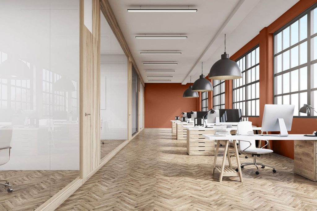
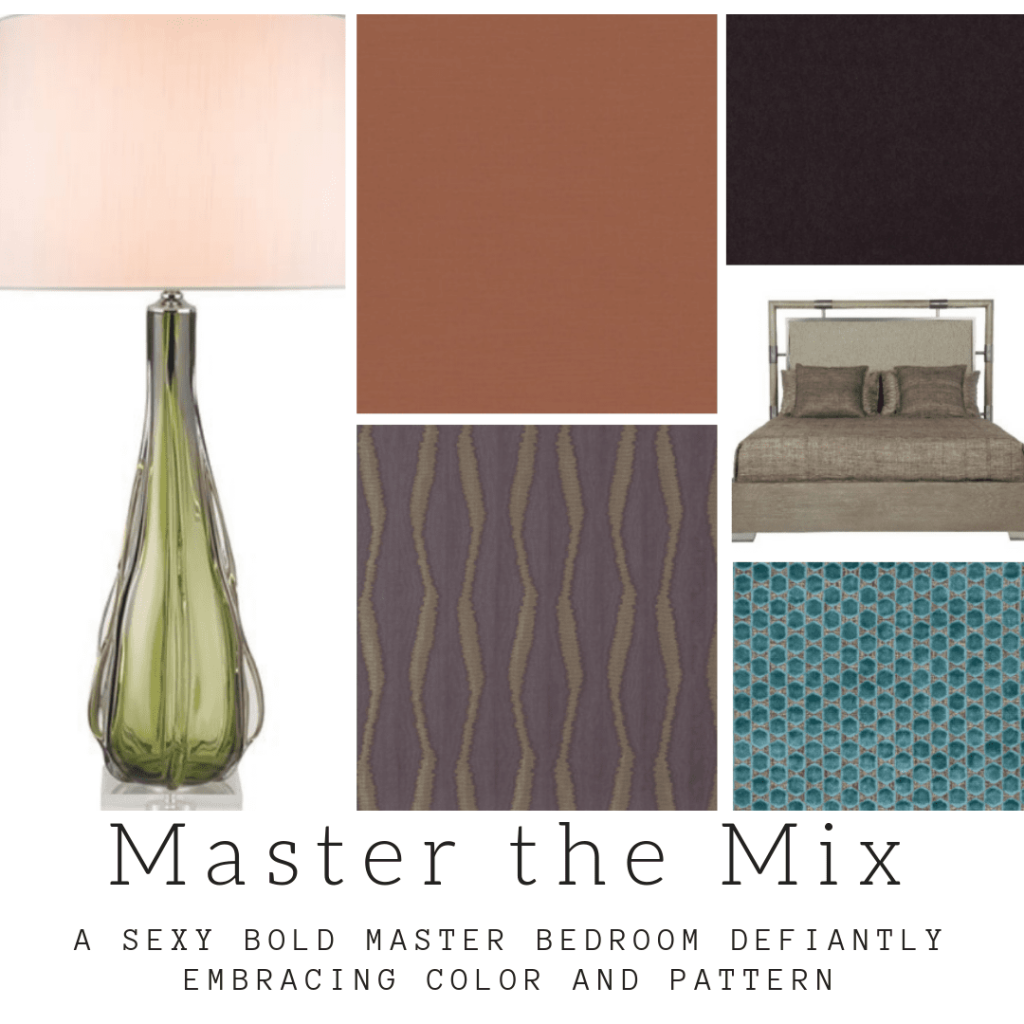
Sure some colors are not great is big doses but when we started the inspiration for the master below, we began with this color– but in the window panels not on the walls. This was a year ago.
Why the furor over this color?
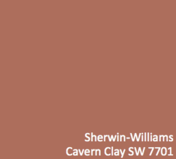
The outrage over Cavern Clay surprised me because it is so workable to me. But again It is not about the single color people- it is about the inspiration to work with fresh pallets!
Think about this color in context- which is the best approach to looking at any color- never in isolation!




9 Responses
This right here! Numero uno reason why you’re my designer bestie. For crying out loud people, we are designers, we can make anything work! #NoColorLeftBehind
:):):)
That ol’ banal burrito of boredom.
Well said.
I kinda like that one too:)
Love this read. Goodness gracious, designers —-> get out of the “big burrito ???? of boredom.” The buying public, atleast those of us with two brain cells worth of an eye, want to appreciate your dynamic deigns encompassing textures, patterns, and colors (and that doesn’t always have to be grey or beige!).
Lol- so appreciate the comments and you are exactly right!
A great perspective on this color.
Thanks Sheri!
I just purchased a new home and painted my living room this color. I’m in love! I just have one issue. The trim, not sure what color I should use. I got the SW Origami White, but it don’t really look like it does on the paint color card. The color is beautiful with my furniture. Any advice is greatly appreciated.