This mid century modern home was beginning to resemble more of a “shabby chic” personality than the vibrant retro vision the homeowners desired!
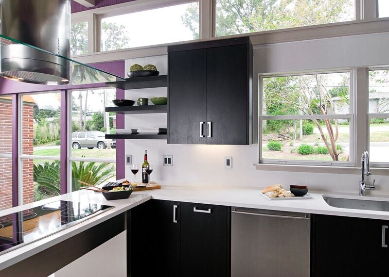
The budget for this kitchen was not large. Therefore, we had to be creative in the approach to solving some of this kitchen’s style challenges. The client wanted a sleek, modern look. Okay, that was half of the client! The other half, the wife, preferred more a kitschy, colorful palette. To get the kitchen to harmonize as well as the two clients, we melded sleek lines with a colorful backdrop on the walls. The darker stained walnut cabinets were chosen to counterbalance the intensity of the eggplant wall paint. We chose blizzard ceasarstone to provide a stark contrast to the dark cabinets. Thus, to coordinate the back splash with an iridescent white porcelain cut into large squares. Instead of a stainless “table” for the electric cook top, we opted for a less expensive option. A laminated metal material to fabricate the legs of the cooking island. The opposite side houses the refrigerator, oven, microwave, and two pantries. Thus, one a good sized pantry with pullouts, and the other a shallower pantry that is home to food and overflow dishware. All in all, this small kitchen has a powerful presence! The clients are happily cooking in harmony!
If you loved this kitchen, check out our blog post for our Top Kitchen Design Tips!

