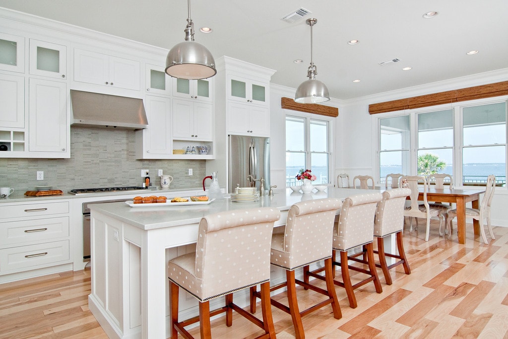
This spectacular new white beach kitchen was designed with a love for the water in mind
The house is not large, but the client wanted the kitchen area to be the main aspect of the design and to be comfortable and serene. The windows were optimized for the maximum view from the eat in kitchen area. The large island was designed for grandchildren to enjoy and to use for buffet dining when cooking outside. The laundry also is a “prep” kitchen that has an additional refrigerator and is where small appliances are stored on the counter -to keep the main kitchen counters clutter free.
The client asked for a fun seaside kitchen with a neutral backdrop of cabinetry so she could showcase her colorful accessories.
We chose classic white cabinetry to complement the maple floors and selected soft white for the wall color to keep harmony with the incredible views. She wanted a no fuss kitchen with lots of counter space for multiple cooks when her adult kids came to visit. Her husband requested a no or low maintenance counter top as well, so we chose a ceasarstone top that mimics traditional carerra marble – but without the associated issues with marble tops. To emphasize the beach living atmosphere, we chose a glass that has a slight frosted wave in it and then turned it sideways instead of the traditional vertical application. The knobs and handles are a mix of traditional and modern, and are satin nickel to match the sink, faucet, appliances. In addition to the large laundry space, one wall is dedicated to storage, features pullout drawers, and houses the microwave as well. Small details, such as the open shelf under the upper cabinets, showcase colorful pottery, and the wine grid help give some dimension the upper cabinetry.
The back splash was tricky, and, when the client and I originally chose it, her husband had a fit!
He thought it was way too modern for the space, but he trusted us to make it look good in the end! The splash is small strips of grayish stone, chosen to softly complement the light grayish-white tops. After the stone was grouted, he called me to say he absolutely loved it! This little touch of modern whimsy helped transform a fairly basic white kitchen into a bright and light, happy space to hang out in.
This is the second home I have worked on for this couple and it was vastly different than the first more traditional home, and it was a joy to help create this simple seaside retreat.
If you like this post, you may also be interested in reading more about small kitchens here! with a small cottage kitchen reveal (on a budget!)


