Coastal Master Bathroom
When thinking classic and timeless design many thoughts may come to mind. In this case our client came to us with that goal, pining for a space that was functional for two but refined and beautiful in all the right ways. When assessing the space, it was clear that much could be improved from the start. Balancing the color palette and sourcing particular material finishes would add dimension but keep the overall tone clean.
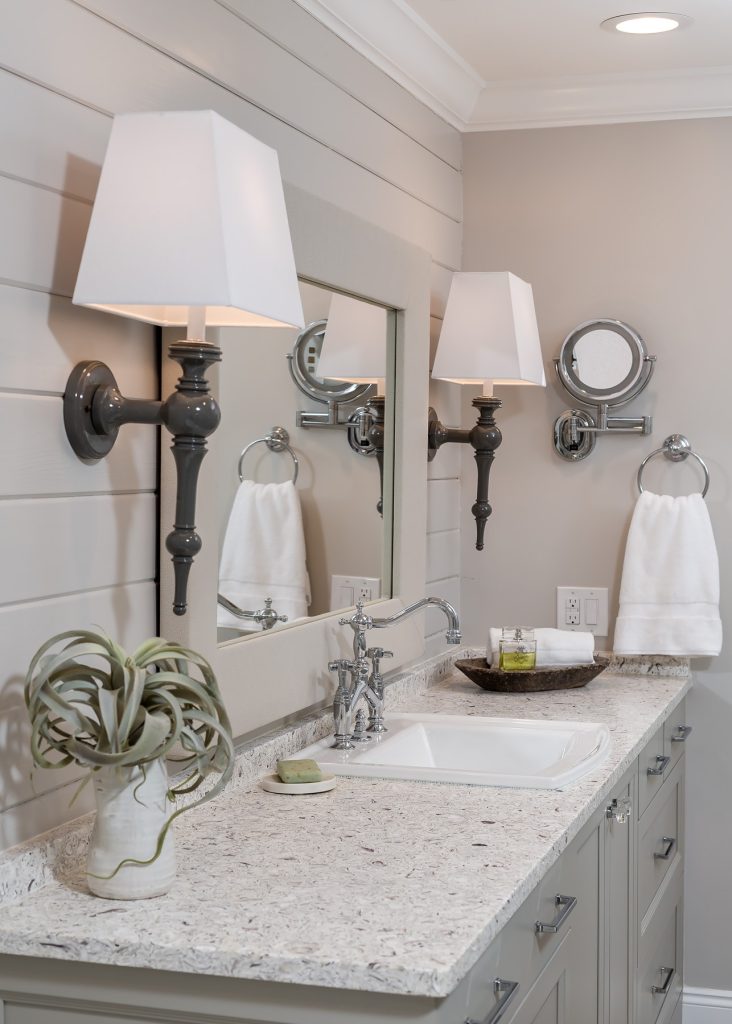
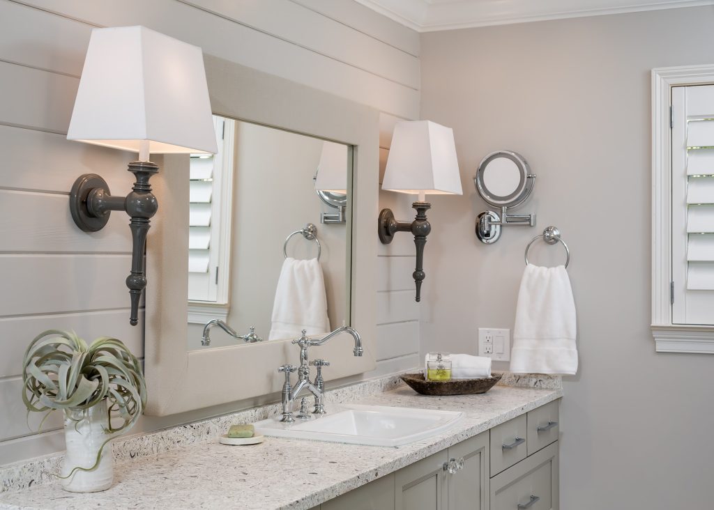
Dual vanities in different locations of the bath afforded the opportunity for multiple lighting and mirror selections.
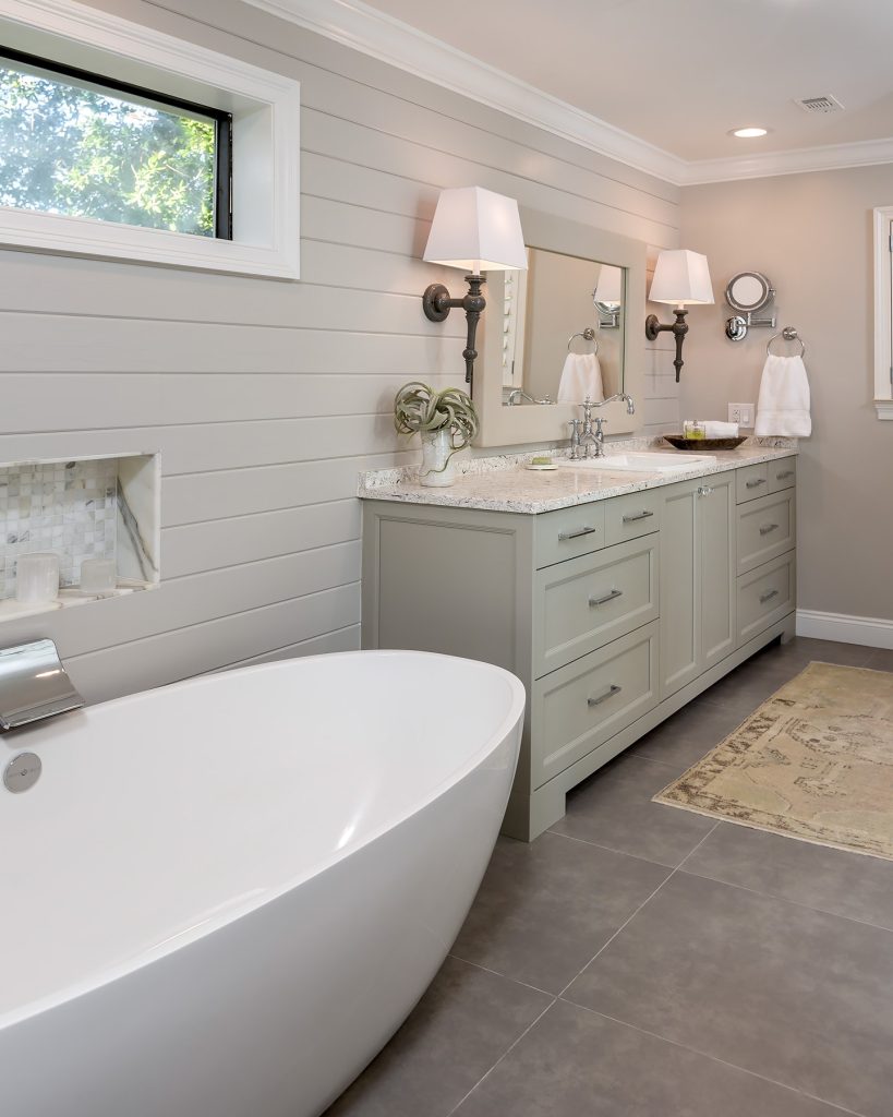
Therefore, adding an interesting design aesthetic in an otherwise typical layout. Achieving the client’s goal to also have the largest tub possible (bubbles for two, please!) acted as a major factor in determining layout. A welcome challenge but one that affected everything. For instance, the placement of the faucet, scale of the vanity and water heater closet. Above all, our favorite elements boiled down to that original design statement.
Classic and Timeless!
The custom upholstered mirror in a fabulous quilted vinyl, sleek fixtures and hardware, soft pops of color in the cabinetry and a fab bench in Crypton performance fabric. All in all, a relaxing retreat for two busy professionals consistent with the feel of their coastal home.
Objectives
- Infuse a timeless, classic aesthetic in a bath that otherwise screams choppy, dated, and old-lady
- Consider existing storage space available for daily needs and extra linens and revisit vanity designs with exact needs and use preferred by the client
- Add more architecture and visual interest to space with material selection on walls
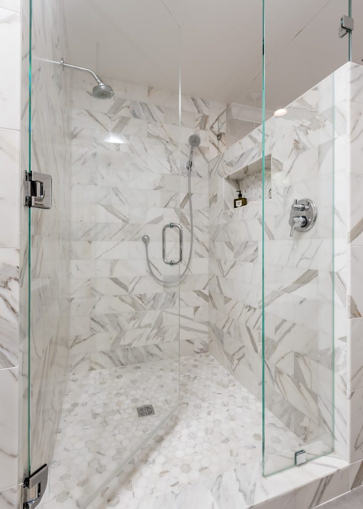
- Client wish list included a large tub and shower that could function logistically and visually for two adults simultaneously
- Create an upscale coastal feel without the stereotypical accents
Design challenges
- Re-design bath and shower space without opportunity to adjust layout or shift floor plan or alter the 8 ft. ceiling
- Maintain dual-vanity areas each with dedicated personal storage (These two wanted to be very, very separate!)
- Open space visually by removing and refining transitions from one area of purpose to the next and adjusting solid planes when possible
- Client’s water heater stopped working and had to be replaced mid-demo (Closet to the far end of tub houses this and no other option with the way house constructed to move it.)
- Incorporate the large transom window into the design layout, making it feel purposeful instead of accidental or an afterthought — the freestanding tub was large (per client’s wishes) and had to be centered under this window to balance the design thus dictating the size of the water heater and the design of the vanity to the opposite end
Design solutions
- Streamlined overall look by incorporating shiplap detail to walls…this also helps to put focus on the walls and not the shorter ceiling
- Installed a “wow” countertop of Vetrostone to further the serene coastal design
- Raised height on existing water heater closet space for new unit and cleaner visual line
- Freestanding tub with wall mounted plumbing fixtures met client’s wishes as it helped afford space for larger tub and freed floor space
- Separate vanity spaces executed with different lighting and mirrors provided extra opportunity for mixing finishes and creation of two distinct areas for the client’s to get ready each day
- Cool, refined color palette brought continuity to the overall bath space and helped update overall
Special features
- Custom upholstered bench in Crypton performance fabric for use by tub
- Custom designed upholstered mirror on the larger vanity
- Gorgeous countertop material mixed with soft color palette! Provided a clean, updated look without being sterile or too stark. Traditional without being ordinary or expected
We love the neutral colors in this Coastal Bath design. Read our blog post about using the color gray in your home! Gray is not dead and we love it!

