A Cottage Kitchen Remodel for a Young Family
What does the client say?
“We hired In Detail for a kitchen remodel. Cheryl and her team were a pleasure to work with from start to finish. They were professional and extremely easy to communicate with as well as quick with responses.
There was a great balance of listening to our needs and guiding us through the design process which truly took our kitchen to the next level! Wouldn’t hesitate to refer a friend or to use again!”
For a great breakdown on the costs of this kitchen get the whole truth here!
Design Statement
A young mom with two children finally had enough with her outdated and non functional small kitchen and laid down the law with the hubby: Either remodel or she was looking for a new house! The greatest thing about this project is that while their budget was slim, they recognized the need for professional help to maximize the space and create a warm family kitchen they were proud to show off to their friends. No real construction on the footprint could take place so we achieved the objectives with a lot of creativity, color and careful choices on where to splurge and where to save.
Objectives:
- Update the overall look of the kitchen space to a classic colorful bungalow aesthetic
- Maximize storage
- Create better seating at peninsula for kids to sit ( not enough knee space currently)
- Be on trend without needing to remodel again in 5 years
- Stay on budget
Challenges:
- Budget constraints
- Keep kid friendly
- Short ceilings
- No storage
- Table and chair seating by the main doorway to the backyard created traffic jams
- Poor lighting overall
- Dishwasher was in awkward location away from sink
Design solutions:
- Homeowner was handy and was open to being part of the unpaid crew to help with costs
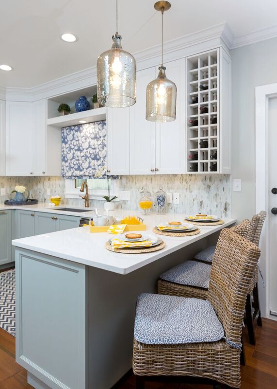
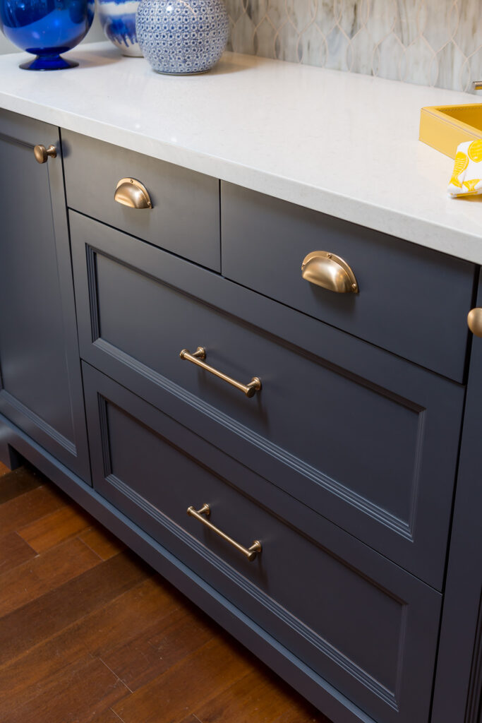
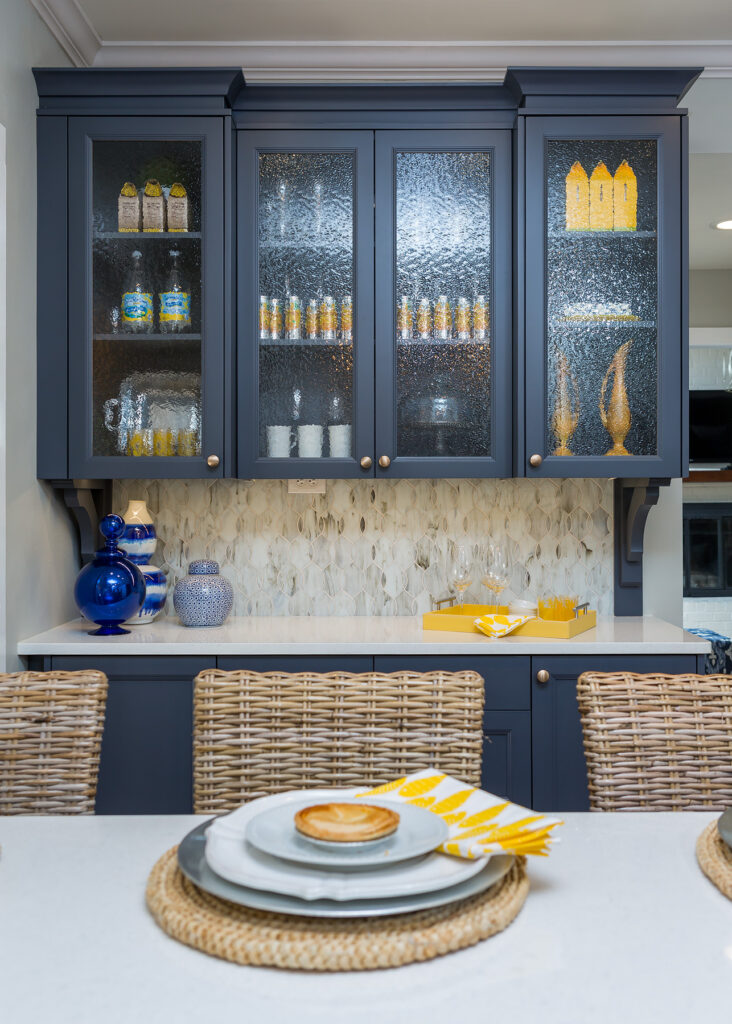
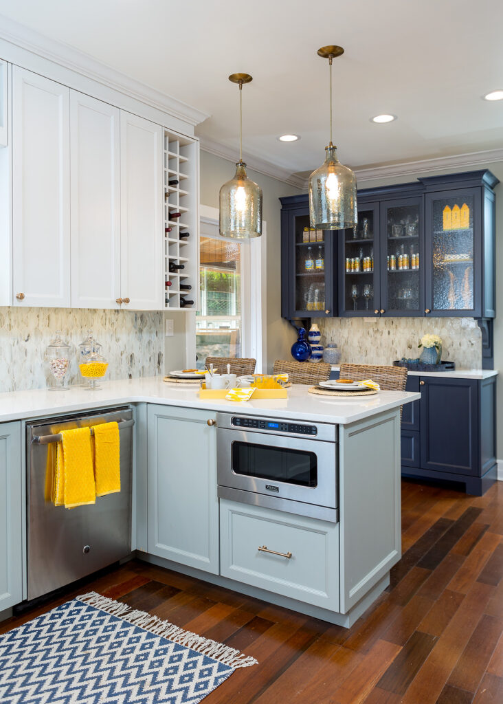
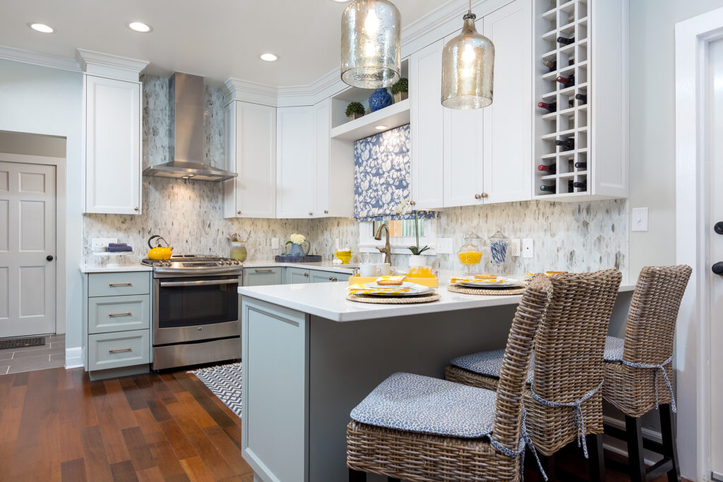
- Created an interesting aesthetic with three colors of cabinetry yet only one countertop to unify the overall space
- Took cabinetry to the ceiling to add storage but to stay within sheet goods costs on cabinetry,we opted for a larger frieze and crown to absorb some of the space yet still achieved overall more cabinetry storage
- Added a hutch piece for good looks and optimal storage
- Reconfigured space to allow for dw to be next to sink
- Microwave drawer placed in peninsula to get it off of counter
- Counter depth ref ig was “built in “ and metal chalk board added on end for kid friendly ( and better looking) art display
- Wine storage for use but also to not have a door interfere with two new pendant lights
- Can lights in key locations for additional general lighting
- Added task lighting under cabinetry
Special Features:
- Wine storage in cabinetry
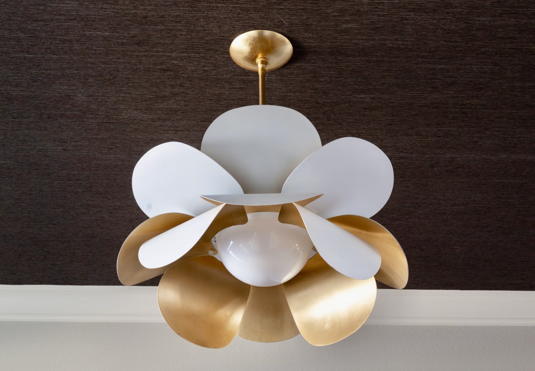
- Interesting pendant lighting which was a splurge!
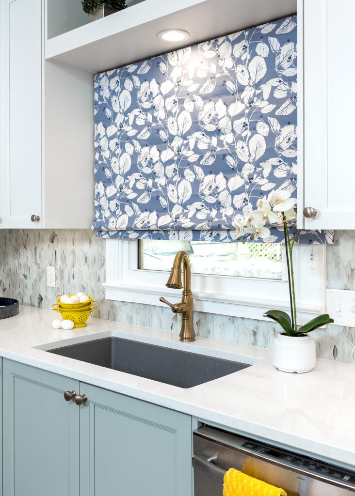
- stained glass backsplash in white
- Magnet chalkboard on side of refrigerator
- Cabinetry to ceiling with large frieze and crown
- Upper cabinetry a lighter shade than base cabinetry

