Colorful Generational Family Home Historic Makeover
What do you do when a prospective client tells you she wants to reinvent her childhood home? Thus, wanting to nix all the dated finishes, capture the charm and make it open and fresh and fun?
You jump up, squeal and get right to work! This is our beautiful colorful historic family home transformation.
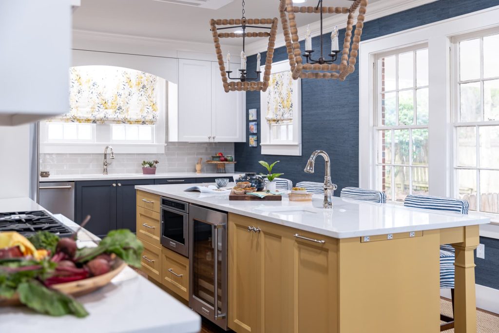
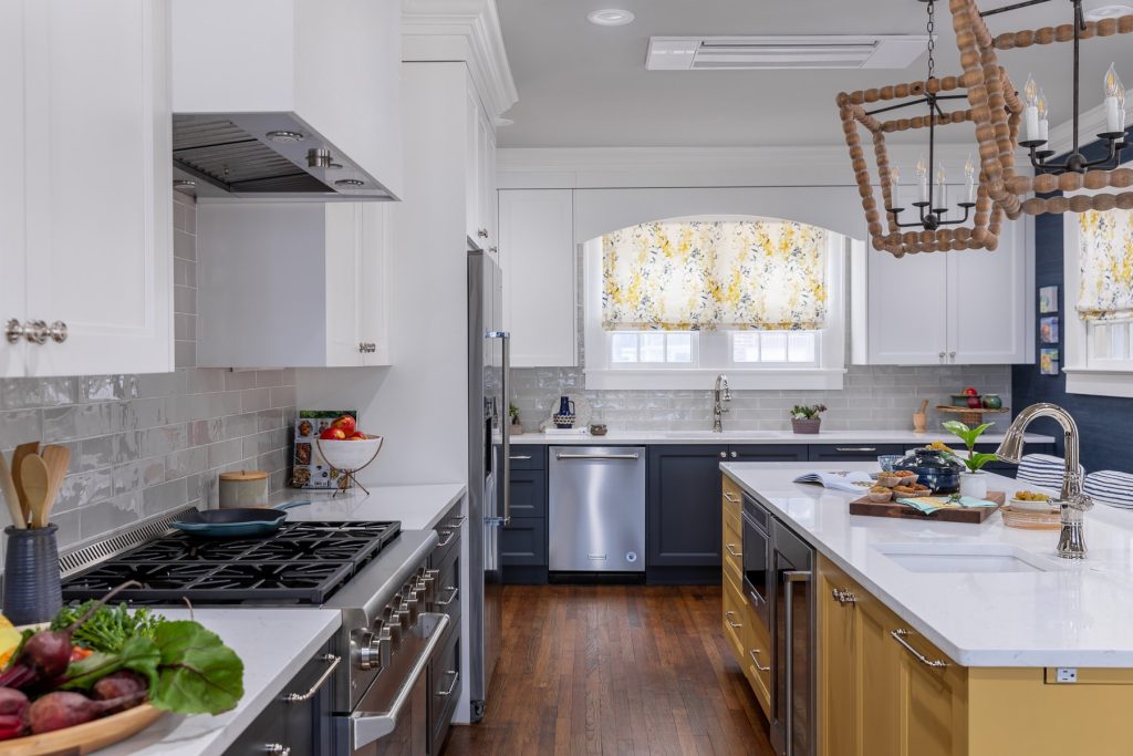
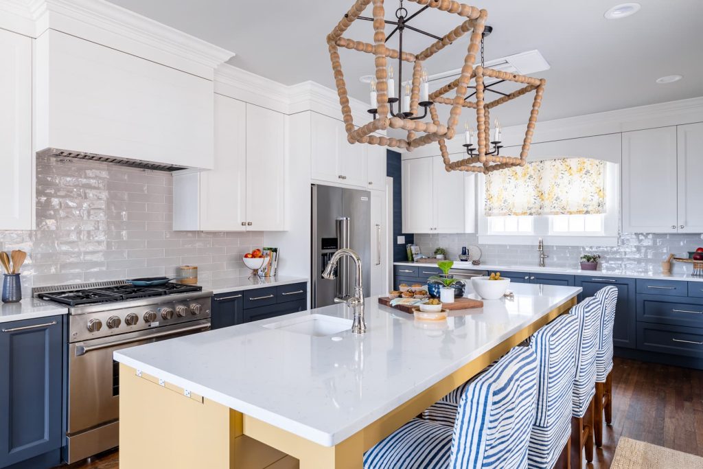
This project was a labor of love that was executed over the course of a couple of years. First, we worked to define a completely amazing new schematic floorplan for the house. Thus, allowing the client’s to decipher some general labor and materials costs to be sure they were prepared. Where there is now a kitchen, previously were three small rooms. The backmost being a kitchen with a side entry off the driveway side of the house. As well as, the most cramped breakfast room you ever did see. The back entry was tight – cumbersome with the laundry smackdab there.
A snug little powder bath with basement entry that left little for a mud-space for a busy young family.
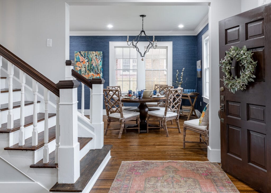
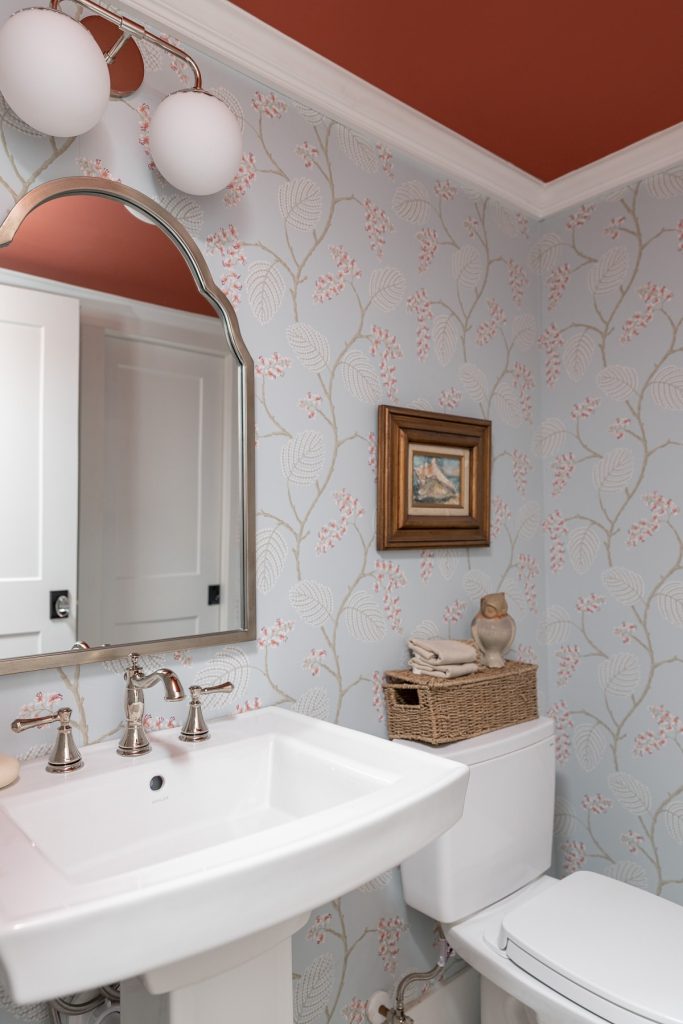
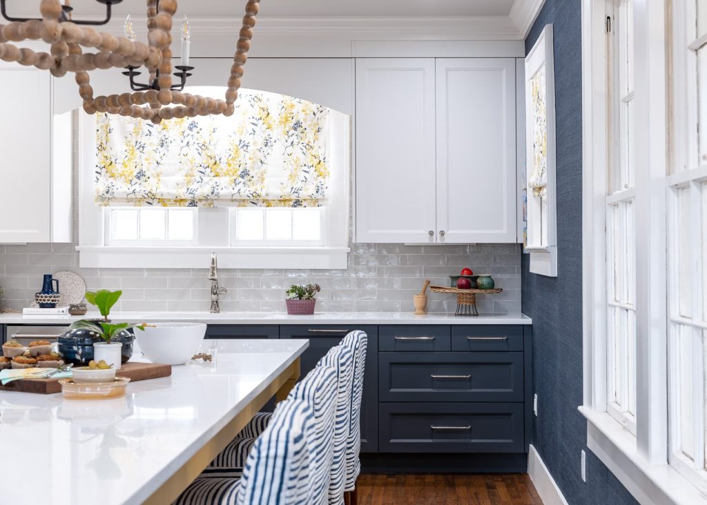
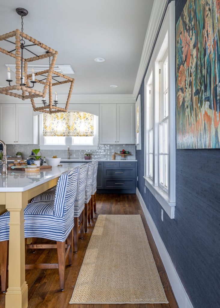
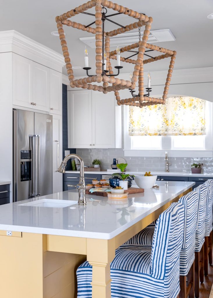
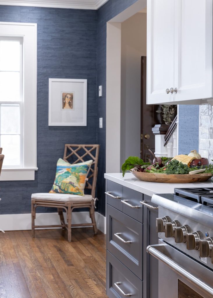
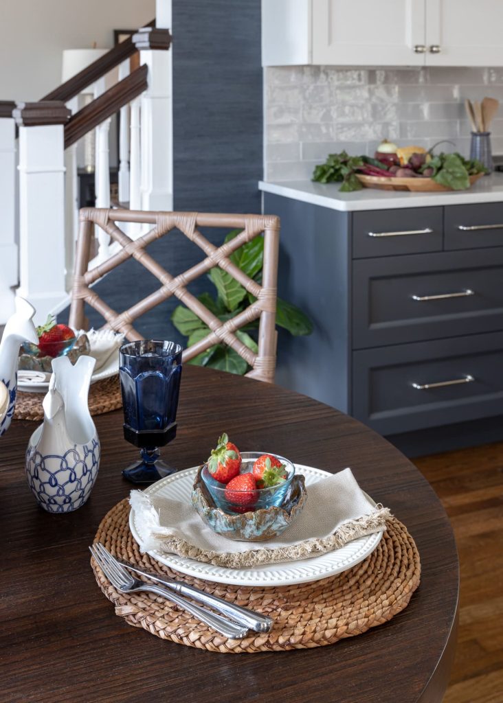
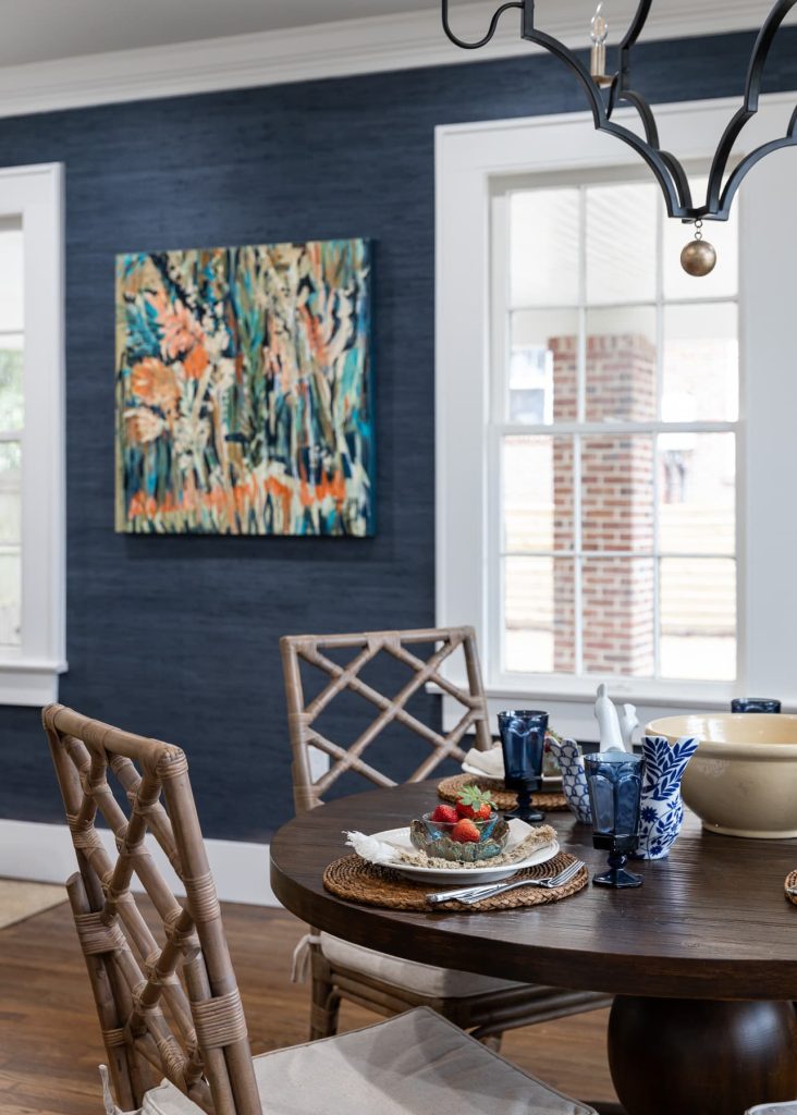
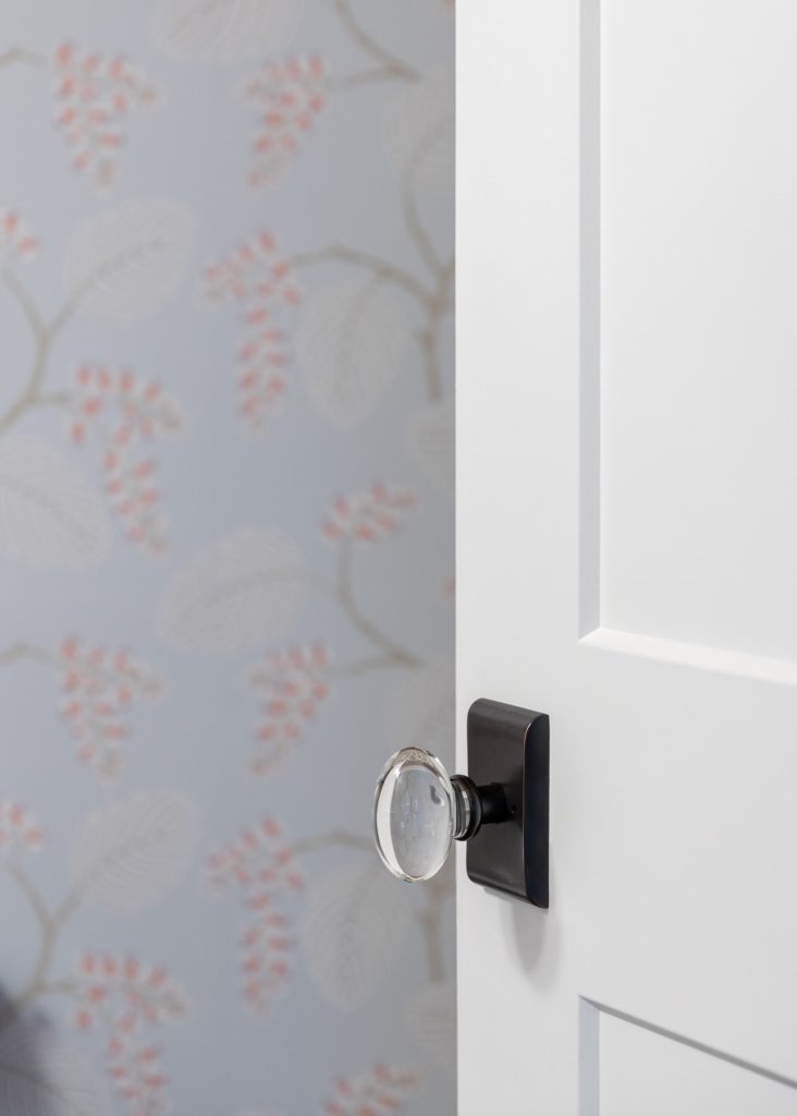
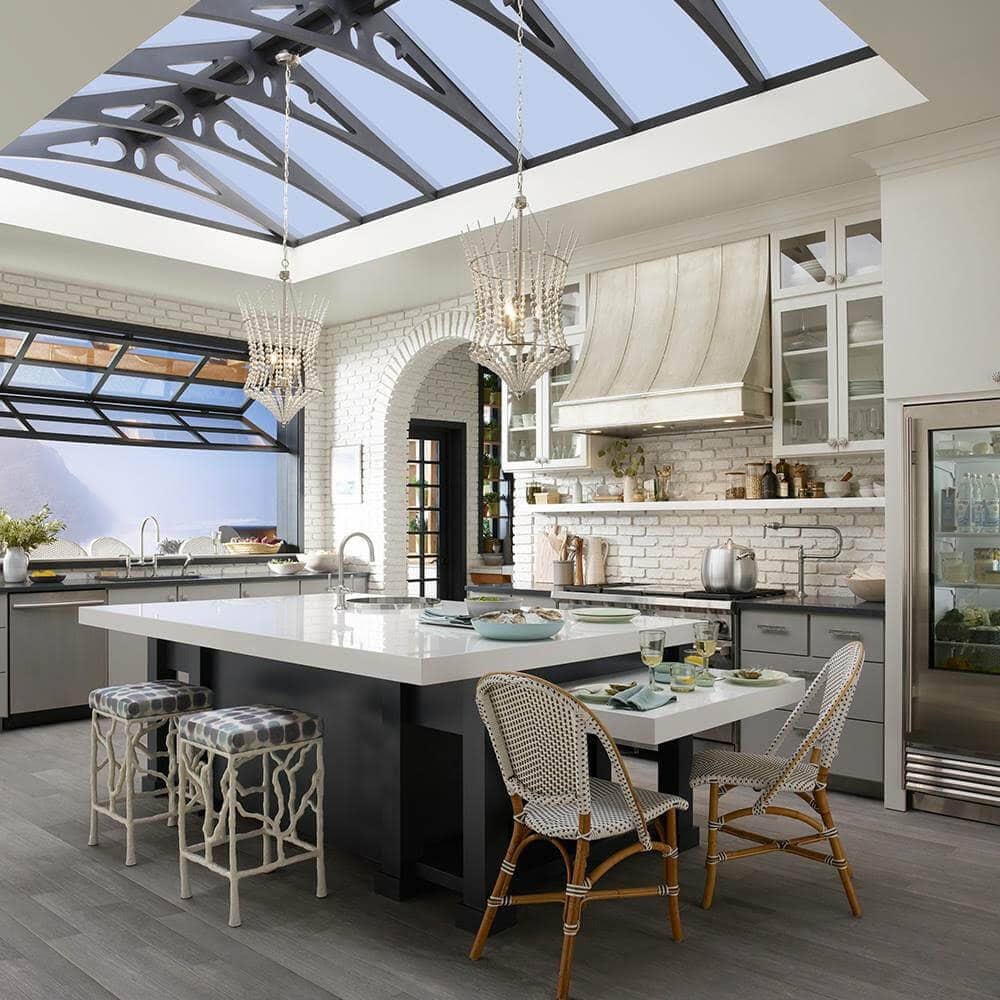
While the contractor was bidding, we were designing this bright fresh new space for the family. Thus, creating a space that truly embodies the word HAPPY. A kitchen with the crisp white, blue, and charming yellow. Gorgeous refinished hardwood floors and completely luscious midnight grasscloth wallcovering – how can you go wrong!! We rejuvenated the main entry too – opening the passage to the kitchen. Creating a more grand feel and incorporating the staircase into the design. (Holy moly you would not have BELIEVED the green shag that came off those stairs!) In proper fashion, we flipped the orientation of the powder to the front of the house and snugged it under the stairs. Thus, creating this perfectly sweet and fun space that everyone who visits the house will enjoy. We were able to maintain a sneaky passage to the basement here. They encapsulated the underside of their home which added so much value for storage right there onsite! Fresh shapes. Fun punches of color. A more open, inviting floorplan. And most importantly – the valuable “found” spaces. Something a truly effective and exhaustive schematic floor plan review can only achieve. This house has a great new life ahead and we are thrilled with how fun the new hub is for the whole family and their friends!
Master Bathroom & Jack and Jill Bath
In a cozy East Hill home, it’s hard sometimes to find the palatial floorplan for a master bathroom. Or enough space for an ensuite for each of the kids bedrooms.In the case of this gemstone of a home, we balanced the budget and found great opportunities for both upstairs bathrooms. Thus, by shifting the placement and layout of the master, and maintaining the existing Jack and Jill. But giving it a totally new appeal! With the master, the floorplan was (of course!) a key element to hone in on. Previously, this side of the house had two bedrooms with a tiny bathroom in between. It definitely didn’t feel like much of a master suite.
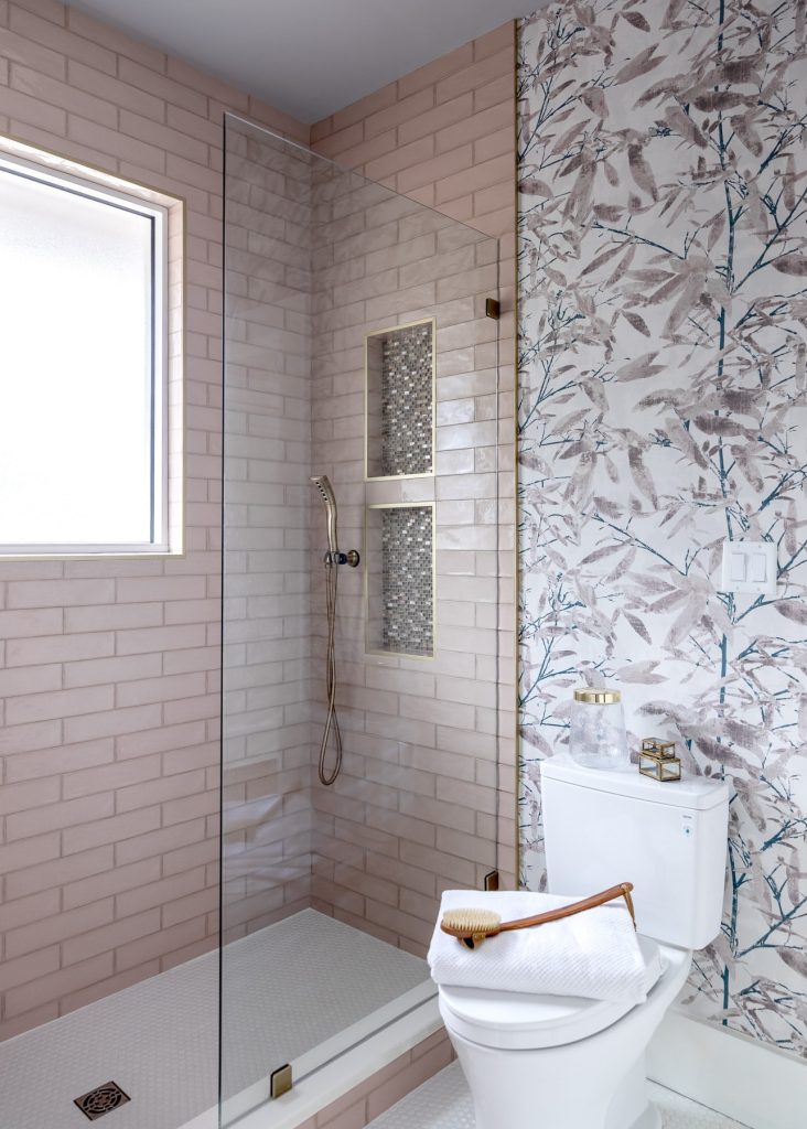
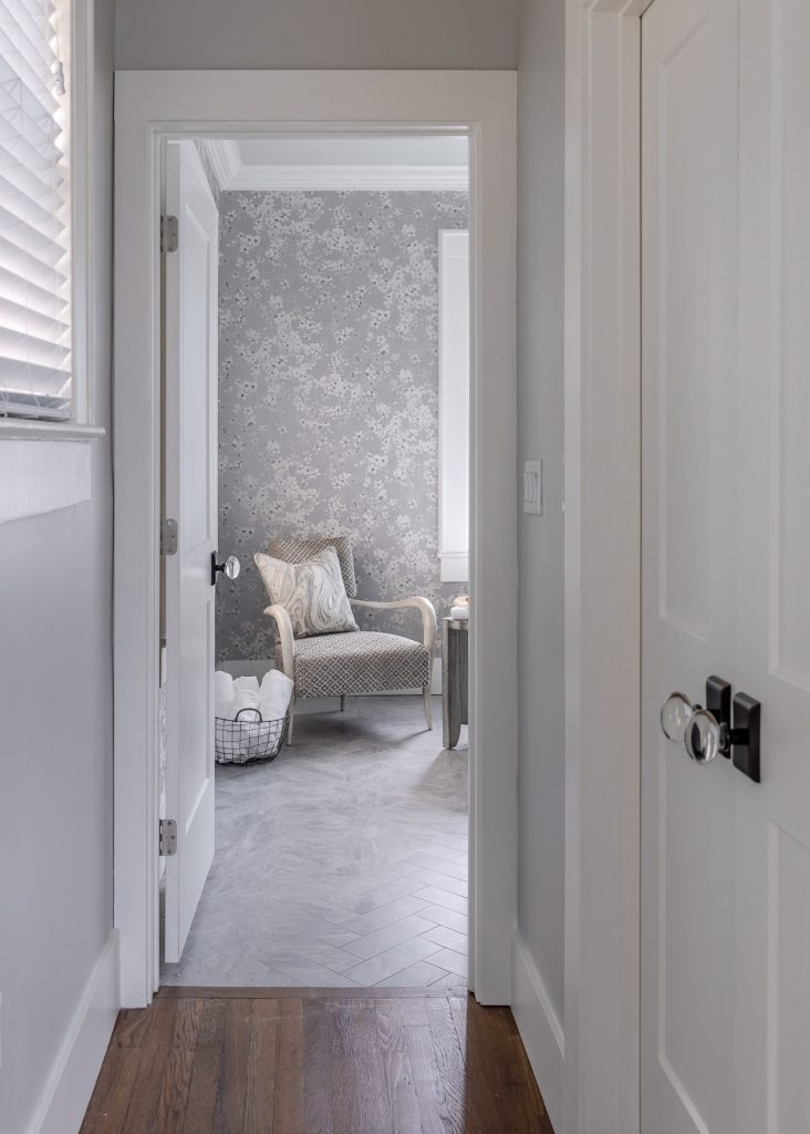
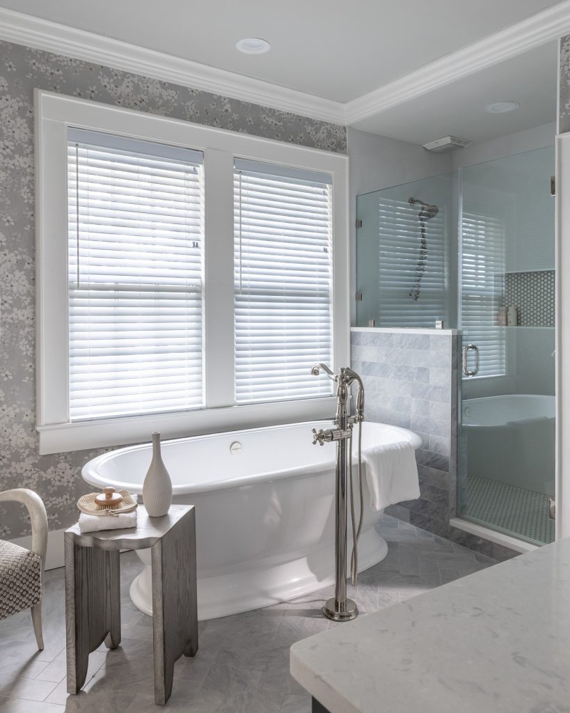
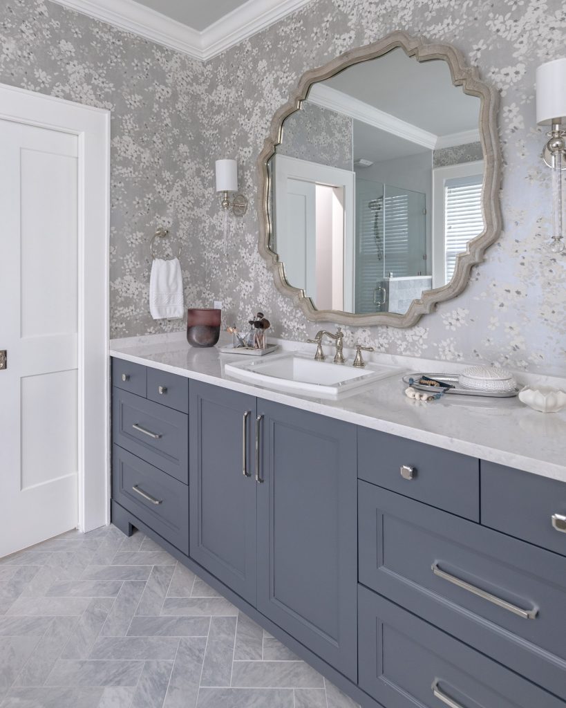
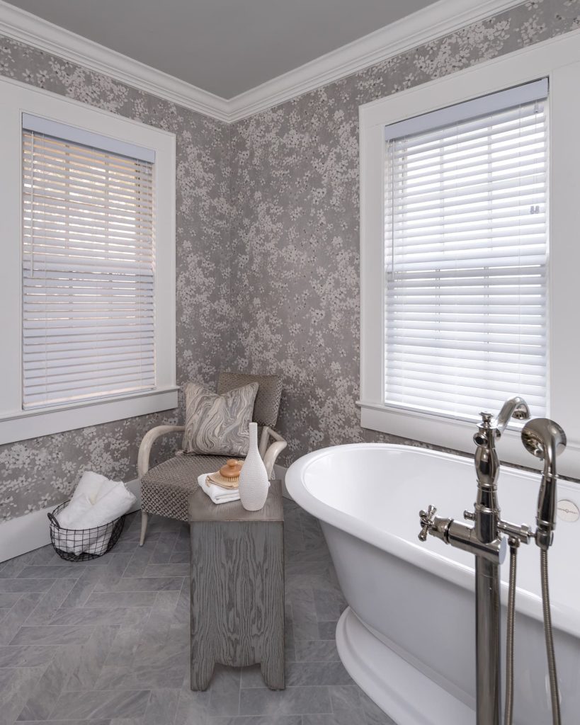
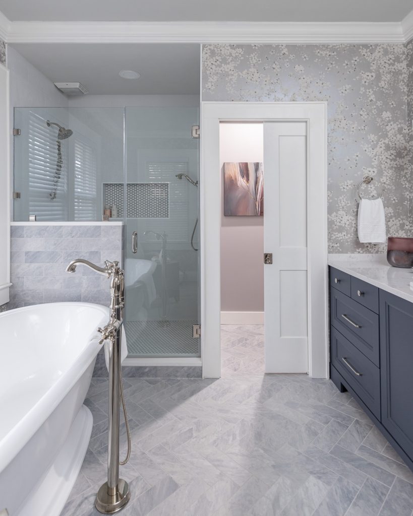
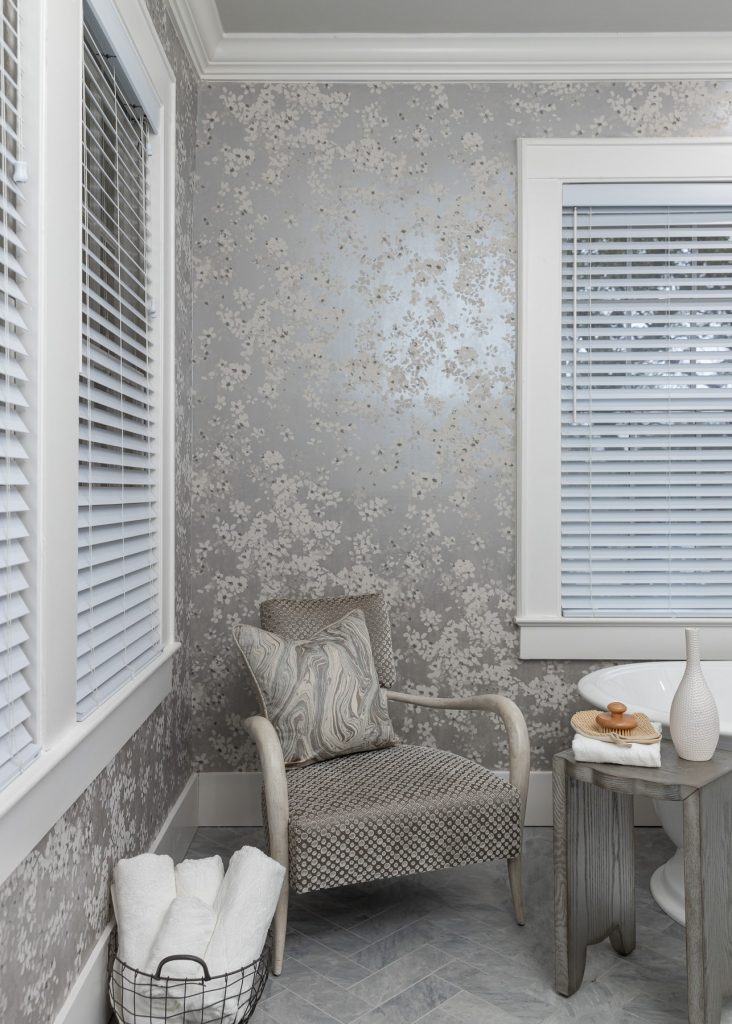
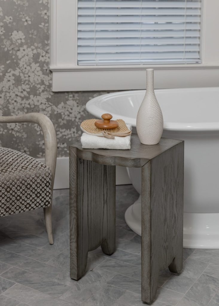
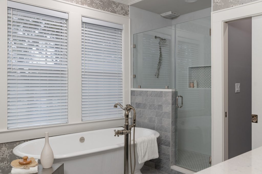
The idea of Mom & Dad sharing with the kiddos or guests day to day just felt a little unfair. So we pushed the overall bathroom to the back of the house. We found space for a dreamy little hallway that connects the bedroom to the bath with a decent sized walk in closet between. Fresh but serene, a soaking tub for Mom was an absolute must have. Dad was keen on a custom shower so we made space for each. Focusing the beautiful volcanic limestone tub on the original back window and finding a pretty, crisp balance in the periwinkle and dusty blue family. The tile textures and colors, dreamy polished nickel fixtures, and slightly pearlescent wallcovering delivered ten fold in adding a variety of textures that the previous bathrooms definitely lacked. We love the punch that the pretty but bold wallpaper delivered in the Jack & Jill.
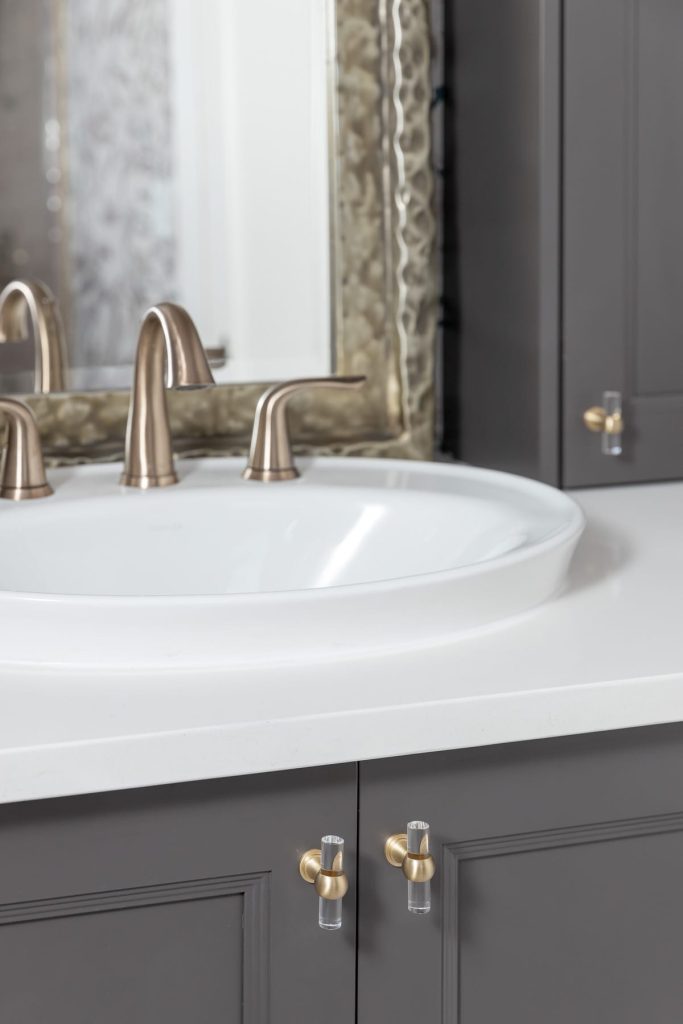
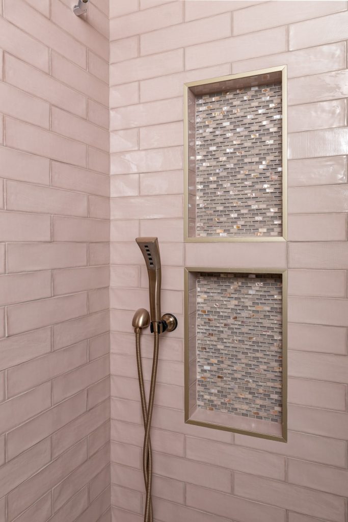
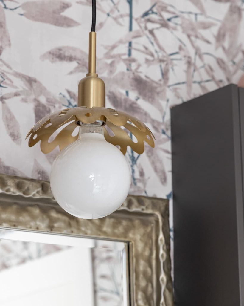
The vanity cabinetry was an extra unique touch offering ample storage for two young girls. Thus, also “hiding” to a degree, the ducting that was put in the wall. Can you imagine being 10 and getting to start your day in that dreamy sweet shower every day? We removed an existing soffit and arch and a lot of unnecessary bulk. Thus, opening the window side of the bathroom for the shower, nixed the old tub, and created a space that is perfect for now. Still totally perfect for the client’s daughters 10 years from now as they grow up. So do not ever think that just because a bathroom is small, it cannot deliver on a lot of levels when it comes to the wow factor!

