Oh yeah, don’t think I am not excited! Kitchen Trends Magazine is a primo magazine for a designer to be in so I consider myself very lucky! (click on the link to take you to the actual magazine photos.)
It is a great kitchen for a lot of reasons, most of which have to do with the small budget and the smaller space. The clients are young working professionals and they were adding onto the house in the back for a master bath/bedroom addition.
Note to self and to readers: This bath will be in next issue of Bathroom Trends…so they say! With magazines…you believe it when you see it!
Getting Creative
This addition took most of the budget but we were able to get creative with the costs. For the record: The table and chairs that the mag prominently displayed were temporary left overs and we all hated it.
There was no great place to position the cooktop. The wall where the Ref/ovens/pantry is located is not as long as it seems. The pantry really is only 16 in deep due to obstructions behind it. And this area is right where the door from carport is located so not so great for a cooking area.
Laminate Table
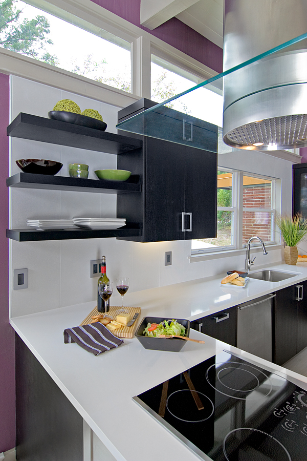
I wanted to keep from closing in the space so we designed a “table” to be home to the Jennair cooktop. The cool thing is this “table” is not made of stainless as it looks to be but Chemetal laminate. Savings Cha Ching!
We wrapped it around a plywood substrate and chased the wires into the corner cabinet where we were able to put the electrical. Since the house was on a slab, this kept us from having to trench concrete. Savings Cha-Ching!
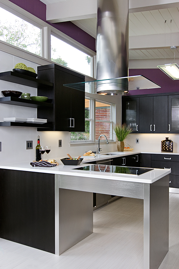
Chemetal laminate legs and apron.A Futuro Hood is a great selection for modern design.
Saving on Electrical & Tile
We also encountered issues with getting new wiring to the hood, light in kitchen and the very cool and quite affordable George Kovacs aluminum pendant over the table. We ended up chasing wires along side the existing beams and then covering them. This was contractor’s idea and I thought it worked very well! Savings Cha Ching!
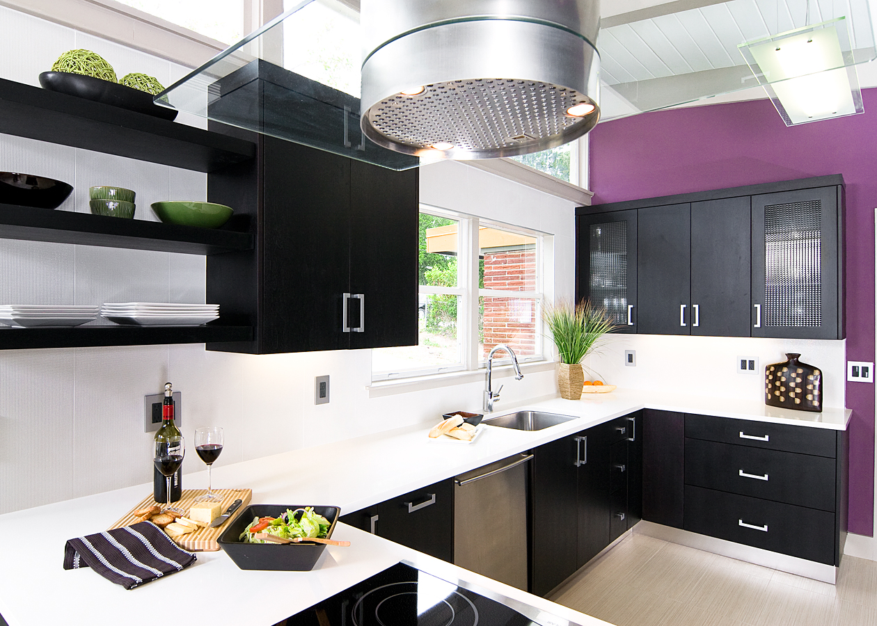
The countertop is Caesarstone blizzard and the backsplash is Artistic Tile “Shimmer”. We exhausted the budget by this point and could not do the full splash originally discussed. But thanks to the wonderful talent of our tile guy John Hale/Flat Rock Tile, we were able to install the 12×24 shimmer in a vertical pattern to minimize the cuts for the most seamless look. And it worked great….at a substantial savings over the full splash of blizzard. Savings Cha Ching!
Mid Century Modern Cabinets
The cabinets also have an aluminum toe kick and are crafted from walnut. We applied a dark stain for almost an eggplant black hue. This works well with the purple walls the homeowner said was a “must”. But the darker cabinetry, simple white on the tops and the minimal backsplash really help the bold colors hit the high notes.
The other wall consists of a nice pantry with pullouts, Refrigerator, microwave, oven and a large but shallow dish pantry for all their “stuffs”. That was a problem with limited wall space for any upper storage. This great pantry space houses almost all of their day to day dishware, bakeware and serving pieces thus leaving the 4 upper cabinets for glassware.
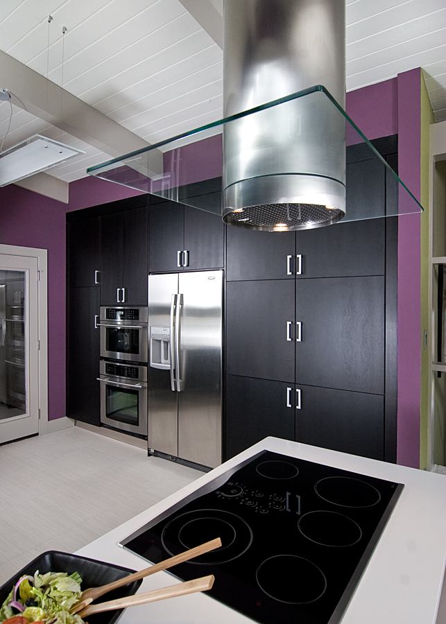
Granted the dark cabinets/light counter combo could be considered played out. But, the truth is the design fit the feel of the retro modern house, played well with the modern aesthetic the young couple favored, and most importantly fit into their pocketbook with some room to spare for the oh-so-cool light fixtures!
We utilized existing where we could…dishwasher, moldings, and faucet. Savings Cha Ching!
Truth or Dare:
I would take one more dark coffee bean kitchen over the oh-so-overdone “smokers haze with a glaze” kitchen any day. To those of you who do not know me yet, that means the yellowy white painted cabinets with “chocolate” glaze that were so popular a few (dozen) years ago.
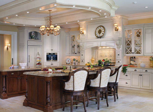
A bit much for me. I keep expecting a curtain to drop from the tray ceiling soffit and someone to step out and take a bow. I wonder if they have to pack a sack lunch to get from the sink to the refrig to avoid going hungry on the trek?
Ok Ok..lighten up… I am just kidding here. Mostly. It is a pretty kitchen with some nice details. I am sure the Stepford Wives will love it.




18 Responses
Reading blogs like this one always makes me feel like a kid with his nose pressed up against the window in a taffy shop! The home we have is the one we will keep, and it is a tract home, which absolutely lets out the wonderful modern designs I am always coming across in my Internet surfing. The only way to achieve something like this for us would be to completely remodel the exterior of the home—and the interior as well! Much too expensive, to be sure! But it’s an idea I find myself fantasizing about from time to time, especially when I see designs like these. There is a real glory to what has been done here, and I thank you for sharing these concepts with us.
Thanks Joseph. I am sure my cabinetmaker would appreciate your kind words also. Will pass it along!
Fabulous kitchen! I first saw it when my hairstylist was passing around the magazine at her shop. It is very creative and interesting!
Why thank you:) It is interesting…..and very budget friendly!
Amazing job Cheryl, you deserve every accolade you get. I swear though, we are two peas in a pod. Your Truth or Dare at the end of this post is the sort of thing I find myself saying to new clients if I don’t watch myself. Where did you find that image? That soffit looks like the underside of a UFO. Please tell me that wasn’t a finalist from you-know-what…
Lovely, lovely kitchen, and so clever too. I can see I’m going to be addicted to your blog. Just trying to imagine the gloomy, ostentatious smoker’s haze kitchen in that house – don’t know whether to laugh or cry!
Um you may be right,,,, it was a Friday night after all!
ah, thanks Sarah…I thought rather funny description of the creamy cabinet look with choco glaze….kind of past it’s prime. So, the “smokers haze with a glaze” term was coined. I just recall taking out cabinets that had that yellowed look from smokers. And old cabinets that had varnish topcoats yellow too….anyway, was written after a glass ( or two) of wine and that is when I start to think I am very funny! My teenagers say I am NOT!
Your imaginative discriptions captivate me. I prefer southwestern but I am compelled to read what you have to say about this kitchen.
Nice work! What kind of outlet covers did you use? They’re very stylish– love that the center is dark instead of white.
Gosh cannot recall name of it but I saved the box because was hard to find them at the time but since have seen them in Lowes!! I will think on it and reply again! thanks for the post
Lowes! Fantastic. I’m often surprised at the clean, simple, and inexpensive designs they carry. My tastes too often run to the fancy/snobbish, but I got a number of ~$20 light fixtures for our 1954 daylight rambler there. Home Depot could take a page out of their book, for sure.
I’m in the middle of a condo remodel with a kitchen that is about 8 x 10. Opened up a wall with a counter height breakfast bar with the sink in the mid. Had my heart set on these dark cabinets and the floors throughout the 1250 sf in braz cherry with ebony stain. Had hoped to carerra marble the countertops and back splash but have been talked out and am leaning toward kashmir white granite. Trying to find the right light fixture and ideas to lighten it up besides putting glass in the top cabi’s and putting a funky rug on the floor?
Any idea’s and love the glass you used here, but can’t locate a “grid” pattern like this kit has.
thanks!
Well you do not say the color of the cabinets. I would not let anyone sway me from carrerra if you go into with eyes wide open. Yes, it is more maintenance…but is it worth it? Some would say yes. Depends on personal tastes. The grid glass is available through a company we use. Architectural Glass Effects. You can contact our shop and they can give you contact info. Kashmir white granite is “ok”. Don’t love. Ask about a granite called “super white”. Not sure where you are but that is what it is called here. It is very similiar to carerra but is granite. Good luck!
Cool use of colors! I like the Matte? finish on the cabinets. I wish more people would get away from such traditional looks. Great job!
ProfessionalPainter
Just by looking at these photos, the kitchen looks splendid! It has a nice, clean, trendy look and the remodeling project did not even cost a lot of money. Adding those features to your kitchen fit the area perfectly.
thank you!
Good stuff, thank you for this. As a contractor this really helps keep me fresh…. Thanks Again…