Why are so many people afraid of color?
Is it about playing it safe? Or not understanding how to strike the right balance? These 4 elements: Color- Light- Texture- Pattern should work in harmony to achieve your ideal environment. When color is isolated from texture or pattern and the lighting- then often the color is deemed “not to work” but really is just missing the other elements. It falls flat or appears garish. The art of visual design in this instance is the harmonious mix of these elements for a pleasing result.
Harmony in design can be defined as an aesthetically appealing arrangement of pieces and parts
Harmonious elements engages someone and feels in balance with the surroundings. Alternatively, if harmony is not present then the space can feel dull or chaotic. I believe an individual is engaged when there is harmony in the design of the space or home you are in. We see this in our shop all the time. People, ages 18 to 89 comment on the feel of the shop- hard for them to often describe- but we know exactly what they mean.
This is not to be confused with color theory that encourages people to buy, however! That is not what we are trying to evoke and is a very different discipline.

But when you walk into an office, shop, or home that is discordant with the elements of color, texture, pattern and light, then often you feel ill at ease and lacking energy. Your brain is rejecting the lack of balance of the design elements essential for creating a pleasing environment whether you realize it or not! Color, texture/pattern and light put together in the right manner delivers interest and balance.

This whole thing about color “coordinating” is all wrong. Colors need to have a rapport- not coordinate- or lordy- even worse- match.
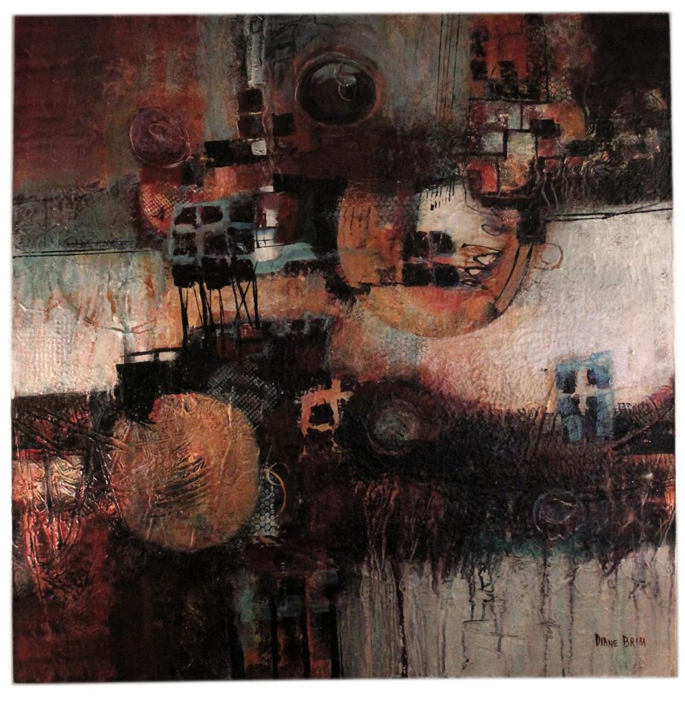
Depth and a layered nuance of qualities with conflicting implications is what brings a colorful space, elements of art, even sometimes an outfit you wear. A sense of harmony that really defies definition because of the sameness and differences all happening in one overall palette.
So what the heck does that mean Cheryl? It means-

Does color work without texture or pattern?
Often it does not and this is the biggest problem many face when decorating their home. Many colors will appear flat and lifeless without pattern or texture. And surely without light! By pattern I really mean not only the obvious but how the color moves within the space, piece of art, the pottery. The subtle and not so subtle nuances of movement inform how the color is read to the eye, in my opinion. This element of my work was developed originally through my study of art history- nothing like studying historical art composition to make you appreciate the elements of good visual design.
This is why it is often difficult to choose paint colors for walls for consumers- they have no pattern to help- and is for sure why I tell contractors no way Jose when they want color before we have even broke ground! Ridiculous!
And please, please know that yes undertones are important- when selecting paint. But any designer worth their portfolio will tell you selecting paint is one small aspect of interior design and not even the first or tenth consideration.

Color mixing in design is really a recipe of sorts: balancing the intensity of the “flavors” and making sure the main dish works with the sides
At first glance the hues below do not seem to want to work together or even be in the same neighborhood- but if you look at the properties of the colors and the balance they really bring in their dissonance, you can see how the addition and subtraction of colors is what makes a room sing. The key is the formula of a pinch of kalamata against a dollop of Moroccan spice with a bit of vintage wine calming the others down.
And no, these colors are not painted in the room, but this is often how we begin a project- by a color palette or a piece of pottery. The beauty of our projects is where the inspiration begins.

Proper lighting is key for color to render as you see it naturally and is the perfect way to create drama and moods- even in more neutral spaces
Another way to infuse a sense of color into a monochromatic space or in a neutral space with several neutrals is to add more light- from lamps, natural light or an overhead fixture- or even a reflective surface such as mirrors or silk pillows. Lighting a home is so important and happens early in the build process so is vital to discuss all of the overall plan up front to be able to understand the needs of the client. Don’t leave this to chance- lighting is the third leg to the triad of design harmony.


Like a brighter intense color? Use wood tones to help balance the energy
Sometimes in certain spaces people want hues that other designers say no way to- I get this as there are colors that are not my favorites. But I will never say I am not going to use any color or won’t because I think if you are good at what you do, you can make any color work IF the other elements are all up for grabs and discussion. One trick to help balance intense energy of a bright infused color is to balance with natural wood tones or darker wood tones. This is like the little black dress helping to offset the bright fuchsia necklace.

Neutrals or high contrast
And so you do not think I am allergic to neutrals- the same principles apply with texture and light. But then the absence of color or a striking tonal contrast is put into the mix. I love neutrals, but my idea of what is a neutral is decidedly not beige or tan.


The truth is color, texture, pattern and light is cathartic to the soul. It is just how you put it all together that really matters – and how much you love the results.
Interested in reading more? Take a peek at this post here about what you need to know about paint!
One of our most popular posts on color is Beige is Ugly!
![]()

2 Responses
Thanks! I enjoyed this. The interior of the house we bought has been painted entirely in one color…called Wet Cement. It works because I am unafraid to mix color and accessories. So it works in all seasons. I really have to step it up in winter but I just buy more orchid plants and books.
Thank you Barbara- appreciate you taking the time to commen!