Bath design has hardly changed in years
I am still seeing many plans come across my desk with many of these design issues. I love the job security! But all too often homeowners simply do not realize what can be done to achieve the same goals without making these mistakes.
I know there will even be designers who may disagree with me and I say bring it on! I am more than willing to debate the merits of what 20 years of experience has shown me to be a more effective approach to bath design. Sometimes it is just simply challenging the status quo.
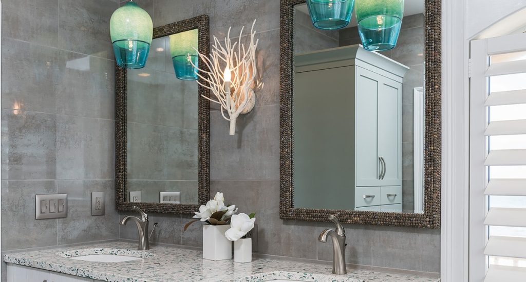
Status quo, myth, or just bad design
The truth is that many “myths” continue to be propagated because people are simply used to the status quo. I want to break open the “tried and true” and expose some of these myths with my clients so we can really get to what they need versus what they are simply used to seeing.
I explain up front that I may make them uncomfortable with the things I am saying but if they have that “willing suspension of disbelief” we can achieve all the goals and then some by just thinking through a few of these myths and discussing options.
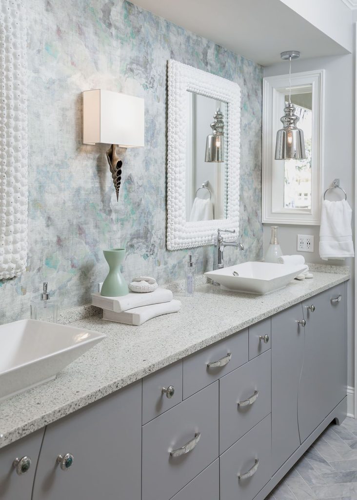
Myth 1 – YOU NEED A WINDOW BEHIND YOUR TUB
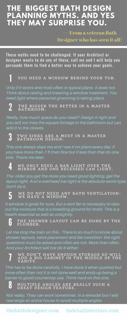
Only if it works and most often in typical plans- it does not. Think about raising and lowering a window treatment. You need light where personal grooming is taking place.
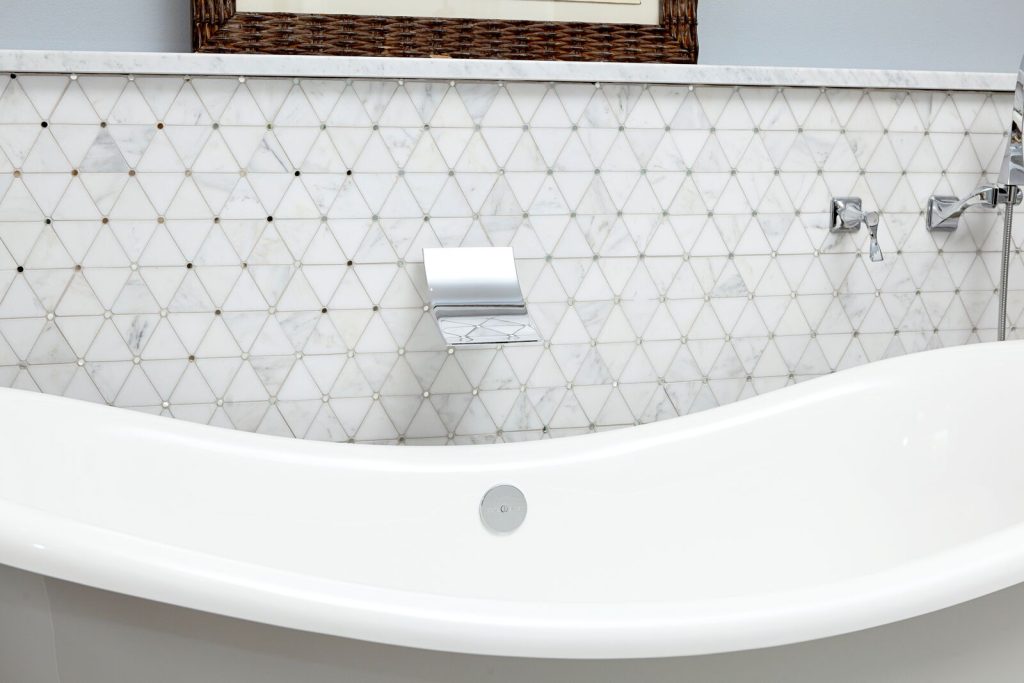
Myth 2 – THE BIGGER THE BETTER IN A MASTER BATHROOM.
Really, how much space do you need? Design it right and you will not miss the square footage in the bathroom but can add it to the closets.
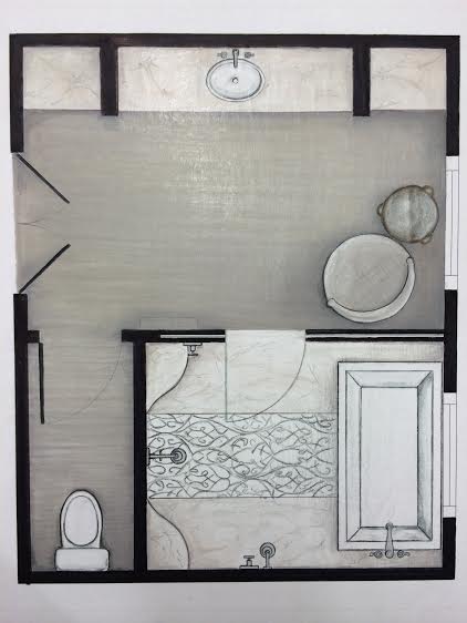
Myth 3 – TWO SINKS ARE A MUST IN A MASTER BATHROOM DESIGN
This one always slays me and I see it on plans every day. if you have more than 7 ft then fine but if less than that do one sink. Thank me later for the much needed counter space.
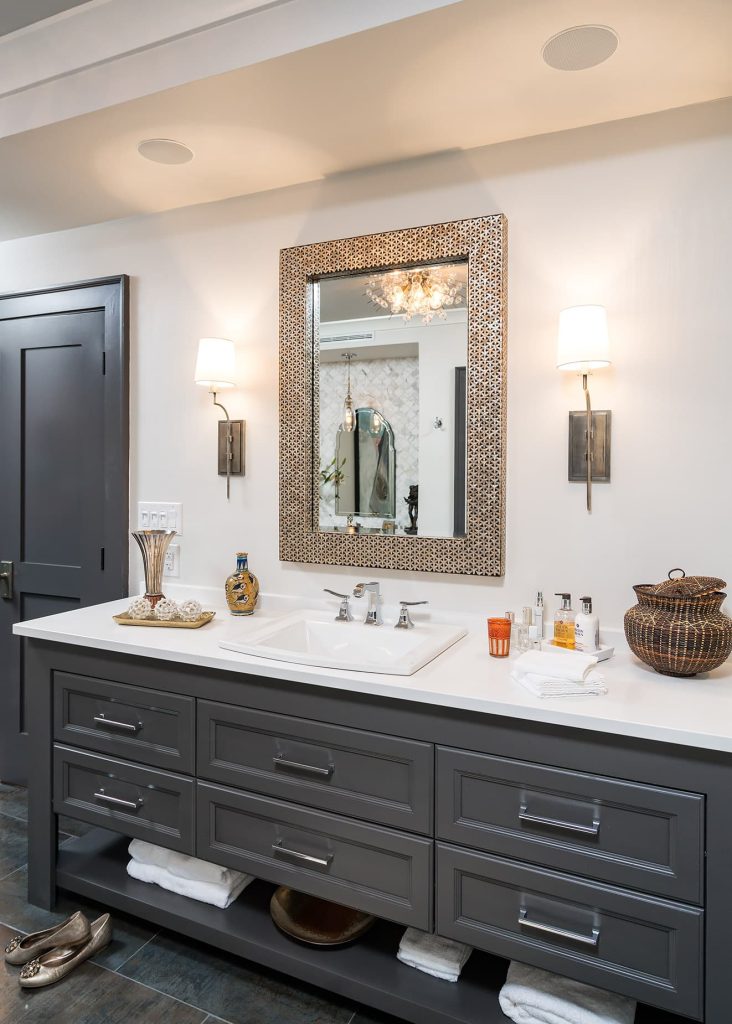
Myth 4 – WE ONLY NEED A BAR LIGHT OVER THE MIRROR AND ONE RECESSED CAN LIGHT
The older you get the more you need good lighting. Get the layout right. And a overhead bar light is the absolute worst type. Shadows galore. Don’t do it.
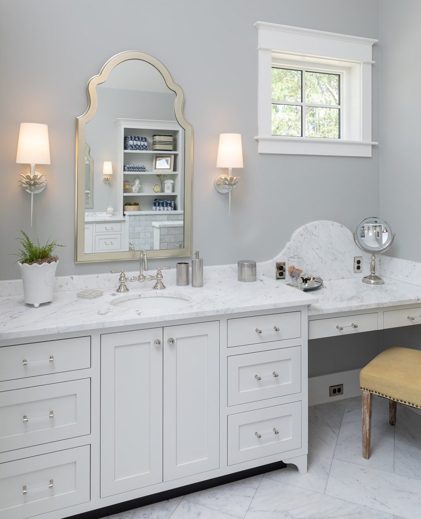
Myth 5 – WE DO NOT NEED ANY BATH VENTILATION- WE HAVE A WINDOW
A window is great for sure. But a vent fan is necessary to take out the moisture that is a breeding ground for mold. This is a health essential as well as unsightly. We find wood rot and mold on many bath remodels that was unexpected.
Myth 6 – THE SHOWER LAYOUT CAN BE DONE BY THE PLUMBER.
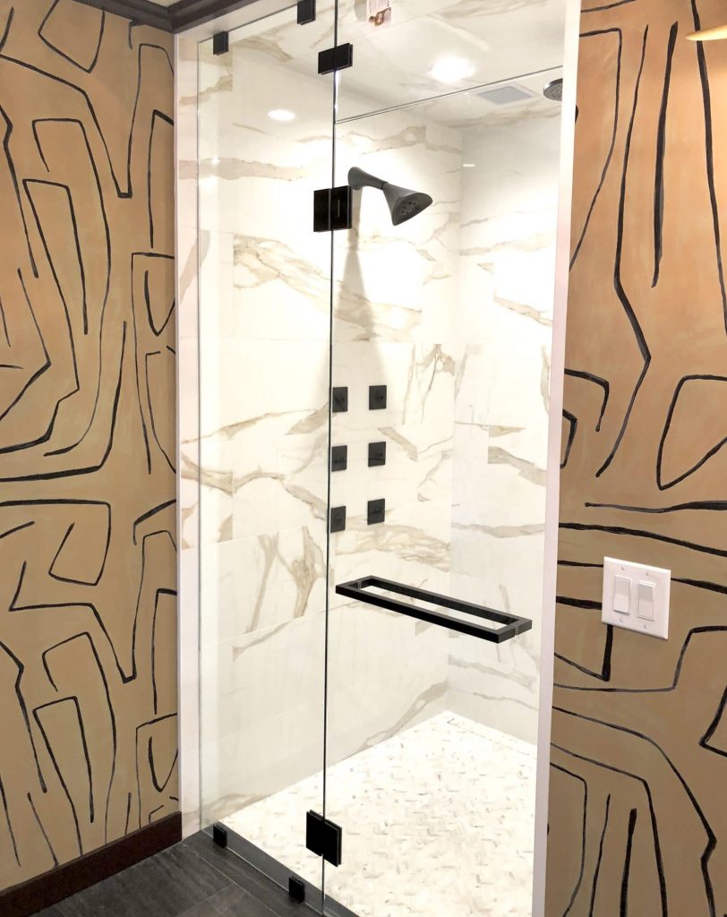
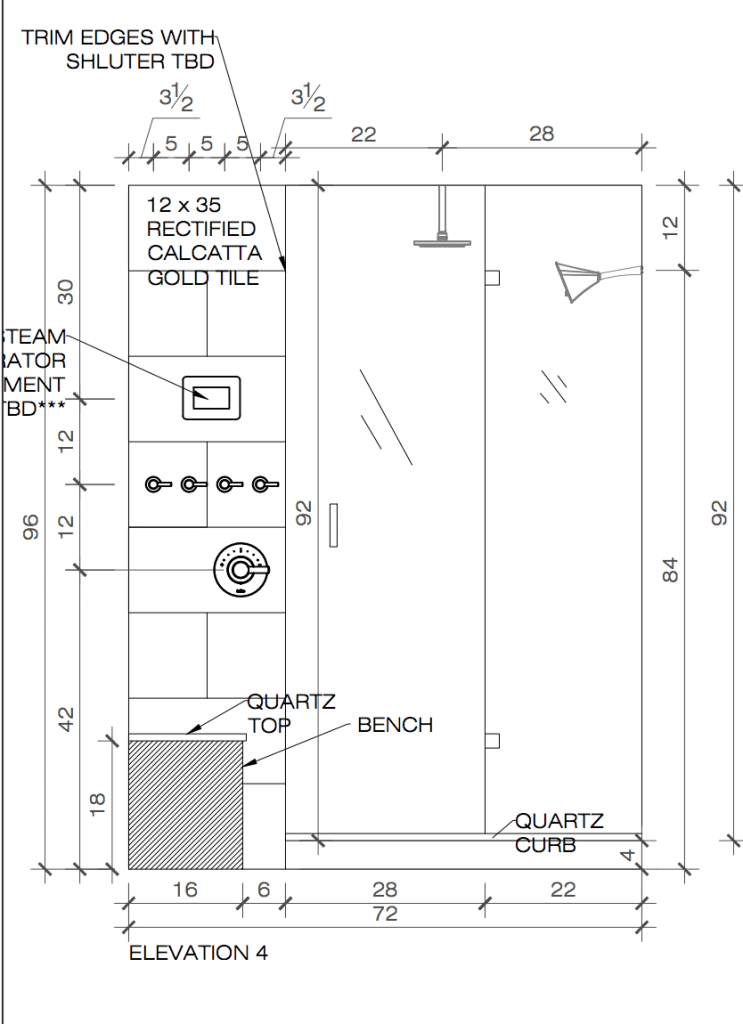
Let me stop the train on this. There is so much to know about shower layouts, valve placement and tile transition- the right questions must be asked and often are not. More than often. And your Architect will not do it either. You have to understand quite a bit about bath design to make this happen the way you want it to- and the first goal is to “know what you don’t know”.
Myth 7 – WE DON’T HAVE ENOUGH STORAGE SO WILL ADD A BIG CABINET IN THE MIDDLE OF THE VANITY.
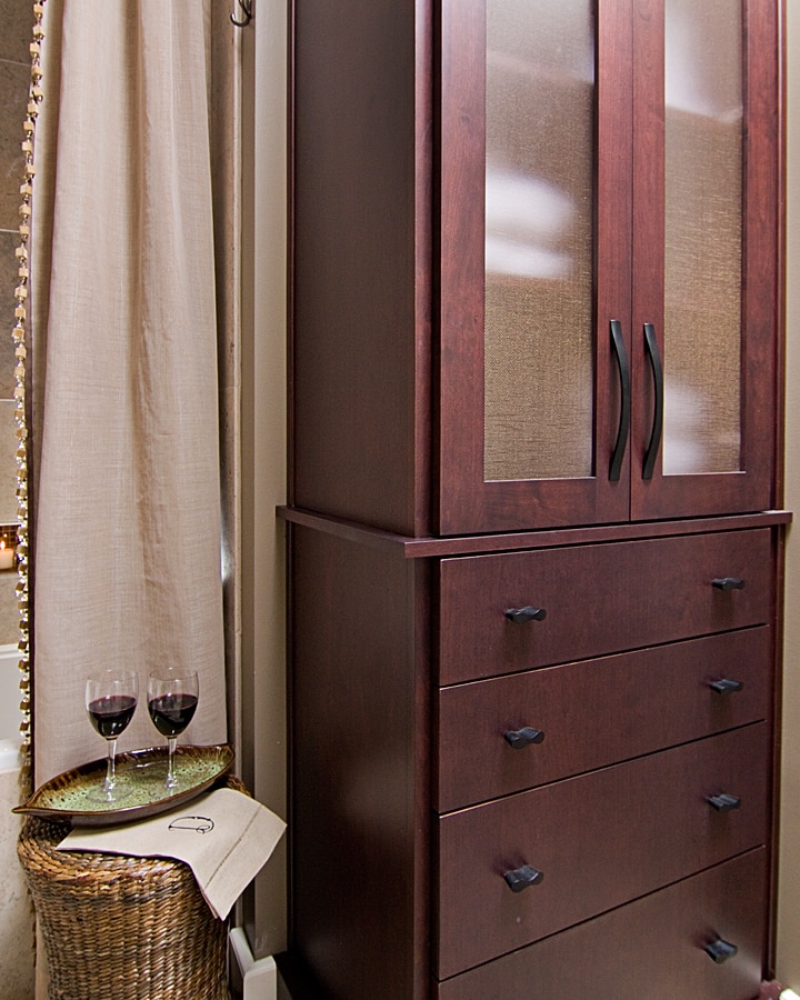
This has to be done carefully. I have done it when pushed but more often than not it is not done well and ends up being a barrier to good countertop use. Think hard on this one. Much better to design cabinetry storage elsewhere in the bath- this can be done in the unlikeliest of places with good planning.
Myth 8 – MULTIPLE ANGLES ARE REALLY SUCH A GREAT DESIGN FEATURE.
Not really. They can work sometimes in a remodel but I will rearrange an entire house to avoid multiple angles.



14 Responses
Cheryl, these are all great thoughts. I especially enjoyed your thoughts on double sinks. I am currently dealing with that one right now where there is room for 2 sinks, but it is tight. I suggested going with one sink. We shall soon see what the decision will be!
Thanks Sheri! Appreciate the feedback as you are such a talented designer!
Yep. The two sink thing is hard to explain to clients. I’m actually insulted every time I walk into my personal builder basic master bath, as my double sink in very tight quarters remind me just how single I am. Lol. But seriously, one sink stores my makeup. I wish I had that counter space instead.
Zomg that is a whole other reason to not do it!!! ????????????
This is SO good! I’m going to share it with my clients!
Thank you!
Love love love! Excellent post! Agree 100%.
Thank you!
SO GOOD, Cheryl! Especially the letting the plumber design the shower! I was recently hired to work on a downstairs living room and office for a new client and she has basically let her handyman and plumber design her whole upstairs bathroom?! She seems to think she only has to pick out the tile and the tub…she doesn’t even have layouts, never mind detailed elevations and they had moved walls and gutted to the studs before they decided on anything at all. I can’t even imagine.
Thank you Janet! And zomg must have a plan! Why do people put the cart before the horse?
Great Post! Love the visuals!!
Really great tips. Generally agree about the two sinks though hard to avoid sometimes. So I just put medicine cabinets everywhere!
I have only lost one of the two sink vs one debate so far- and not one client has ever come back and said wish had done two- it just makes more sense in a smaller vanity- more countertop is what most of us need- and storage too! Thank you for commenting!!
I’m also dealing with the two sink vs. one right now. Great list Cheryl!