Tips on installing tile right!
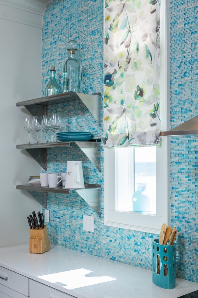
My friends at Kitchens.Com gently suggested I follow up my tile tirade with some examples of what good tile execution looks like. I aim to please and it is an excellent suggestion!!
The world of tile according to Cheryl. Now, I do not claim that everyone will like all of this material or way it is laid out but, you will have to admit, it works for the style of the space.
I still maintain, however, that while the tile execution in the previous post was the biggest problem in many of the examples, the materials really were not worthy either. Sorry. But, I am paid for my advice based on my years of experience, my creativity and my attention to the details so I have blog it as I see it. Badda Bing!
Sometimes knowing what is NOT good is productive in learning what IS good.
You know my favorite line is that If I just agree with you Mrs. Yumptyfrump, I can leave and go home. But the day I succumb to the temptation to be anything other than me, myself and I…is the day I gotta hang up the tape measure. Sometimes it is hard for a designer to circumvent a poor design idea from a client but in my opinion, this is critical to speaking your truth. And, I am nothing, if not truthful. I will run more photos of great tile execution in the next few days. Do you have any great tile executions that you would like to share here? Let me know or email them to me!
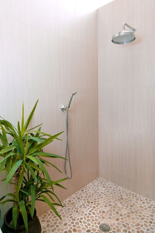
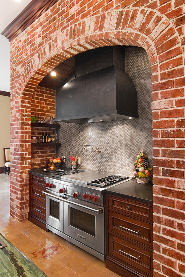
This alcove could have become very busy very fast. The small gray stone works with the hood and the brick..and makes the brick alcove the star of the show. Note the spanish gold marble on the floor. I love the classic juxtaposition with the rougher brick. Designed by In Detail
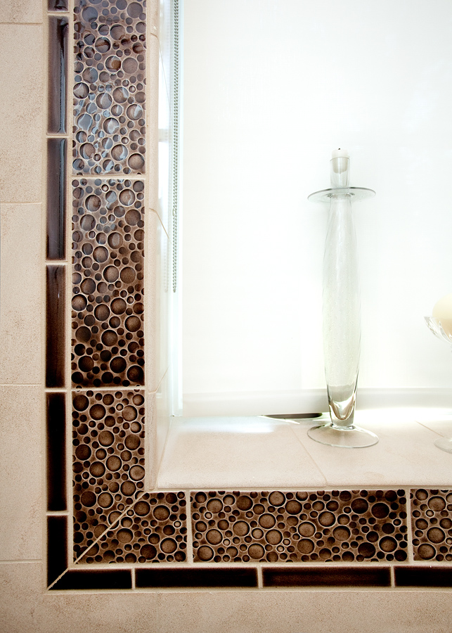
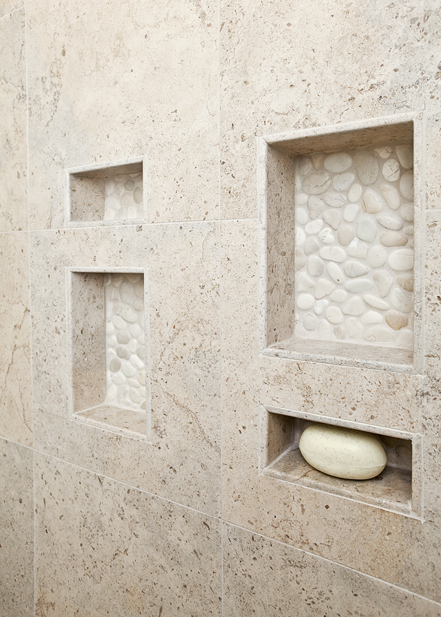
Here is an excellent idea to showcase a window. Use the more expensive funky tile around the window as a “frame” and then utilize the field tile around the rest of the shower. This window is in a shower! Designed by In Detail. Tile by Pratt and Larson



19 Responses
Ahhhhhhh!
That’s better. Me likey everything!
Gorgeous work Cheryl, you really need to meet Sara Baldwin at Coverings. You two are soul sisters I swear. That “bubble” tile you used as a window frame is inspired.
Thanks Paul…yes really want to meet her if she has the time. That tile is from Pratt and Larson. I need to go back and put in the hyper links! I forgot!
Much easier on the eyes and soul.
Great examples! Trendy and Beautiful.
@KitchAnn_Style
Ann: Thanks for the nice compliments. I hope everything is going well for you in the new space too!!
I’m not a designer but I know enough to appreciate beautiful work. Wonderful…all of them.
Hey Fran! Thank you for stopping by! We NEED the non designer perspective to keep us all straight! Thanks for commenting!
Thanks Raina and Laurie:) NIce way to start the day!
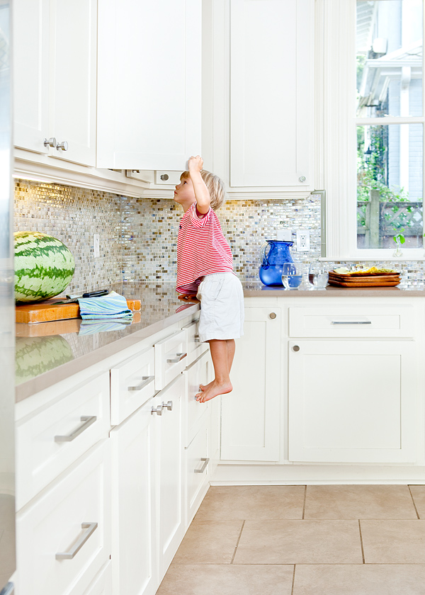
Very nice, very nice. Discretion is the better part of valor (and tilesetting). And your cabinet climber picture is a showcase for the hardware manufacturer’s product quality. No white metal castings here! Note to self: don’t place drawer bases under the cookie storage.
Another artisan tile company you might enjoy (if your omniscient self isn’t already aware) is my good friends at Trikeenan Tileworks in nearby Keene, NH. Gorgeous glazes and execution – with a big green commitment too.
Thanks Rick. I do know Trikeenan and I love their work. Would like to get some of their samples for new showroom but do not think they have called us back? I am not sure exactly because the peeps at shop handle that stuff…but I remember getting a sample before KBIS one year that was a magnet…and I thought so clever…I still have that tile and I think another one too on a large manget board holding up some of our project photos! If you know them, tell them to give us a shout! It is the type of product that is right up our alley.
I can’t wait to see that little tile job that you are doing in that East Hill half bath!
Oh yeah…that will be a killer bath….if the slow boat ever arrives…..
I really like the pebbles in the niches in the first photo! Great work!!
And the little boy is adorable!!
Hey there,
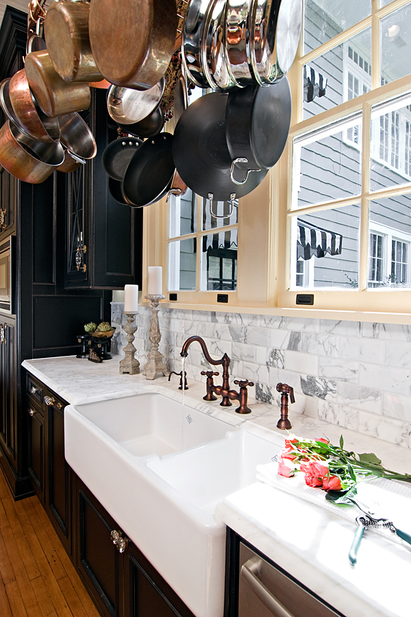
I’d love to meet with you at Coverings! Paul, thanks for mentioning me/us at New Ravenna. Cheryl, I really like all your installation photos and, as you can imagine, I am extremely picky and opinionated about tile design. That Calacatta back splash is divine, and the stones in the back of the niches are brilliant. Sonoma tilemakers are buddies of mine, so I am delighted to see you use their things, and I’ve always admired Michael Pratt’s talents. Have a super week, and I look forward to meeting you.
Sara Baldwin
Of course Sarah! Would love to meet you. One of my designers will be coming with me also! Let’s plan on it. Since we are driving have not made plans as to when rtivong but let’s stay in touch!!
Have the same white marble in my own kitchen (and the farm sink and the dishwasher!) the black cabinet historical kitchen that is…also have a similar little boy “cabinet climber” as the other kitchen! 🙂
Good follow-up, Cheryl! Gorgeous examples (love the kidlet too!). I love Pratt and Larsen too. I hadn’t seen the latest bubble tile that you used – those are pretty!
Cheryl, those tile jobs are fantastic. You must have a fabulous tile supplier. ; ))