I am on a roll with some new projects being photographed and thought would share the actual before and after pix! Seriously, some of these are incredible and I have to wonder…what were they thinking?? In this case was originally built ..by a builder! Scary. So much money spent on such silly treatments. The current homeowners had enough and were ready to get a functioning pretty bath!
BEFORE
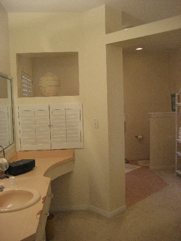
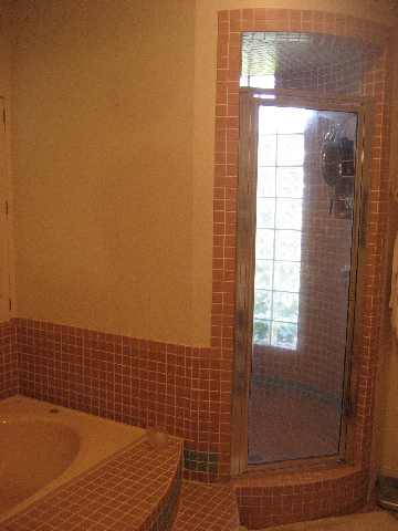
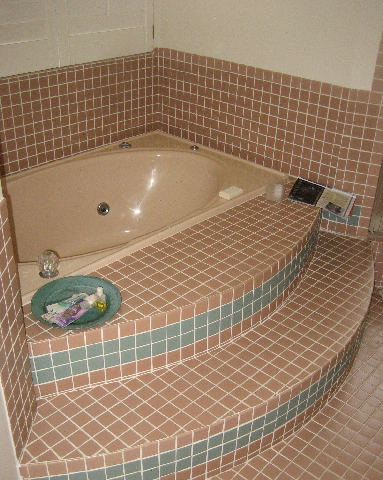
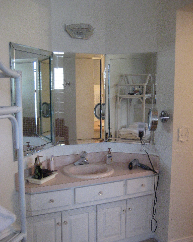
When we got into the demo of this bath, we discovered the lovely glass block wall was being held in ONLY by the exterior stucco! That is how much wood rot we found!
The round shower is a horrid waste of space and I am not sure if dislike the shower shape or the 2×2 MAUVE tiles more! The redo was budget conscious as the owner may sell the home in the near future. But, they were anxious to enjoy a new space that worked better for their needs.
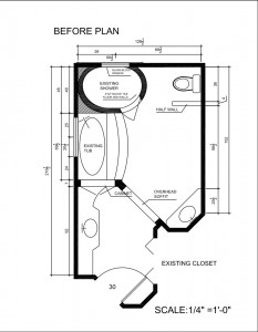
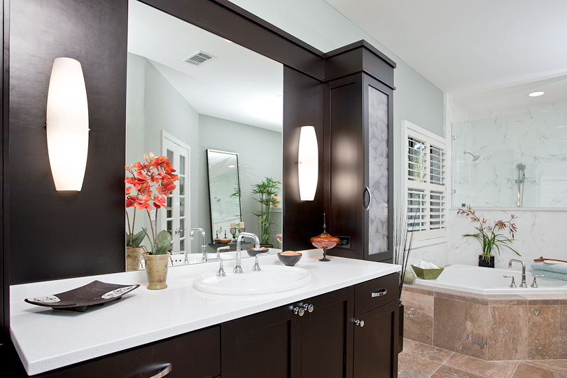
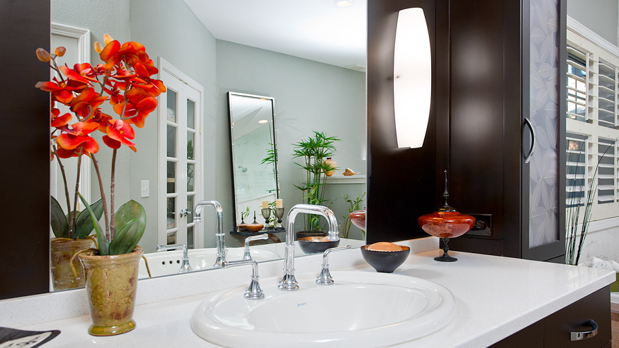
The before plan really had odd angles, a sink that they never used as it was awkward and dated fixtures and materials. We took the second sink and made it into a great linen closet with glass doors. I feel like a second sink is not always necessary. You may wash your face, shave and brush your teeth over a sink but let’s face it…what most women need in a bathroom is more counter space anyway! The client agreed so we now have a very functional inen cabinet.
AFTER
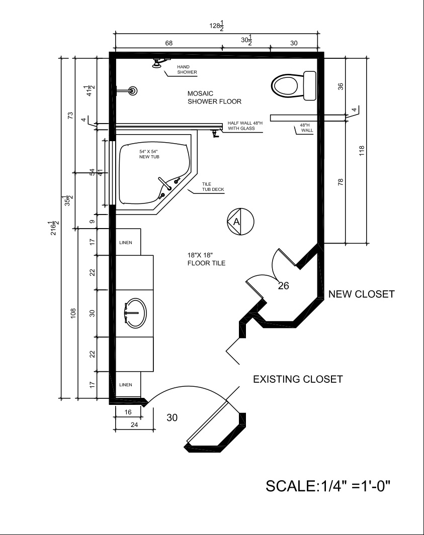
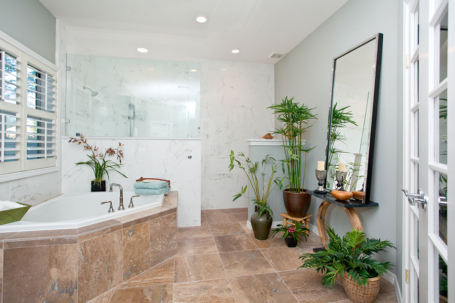
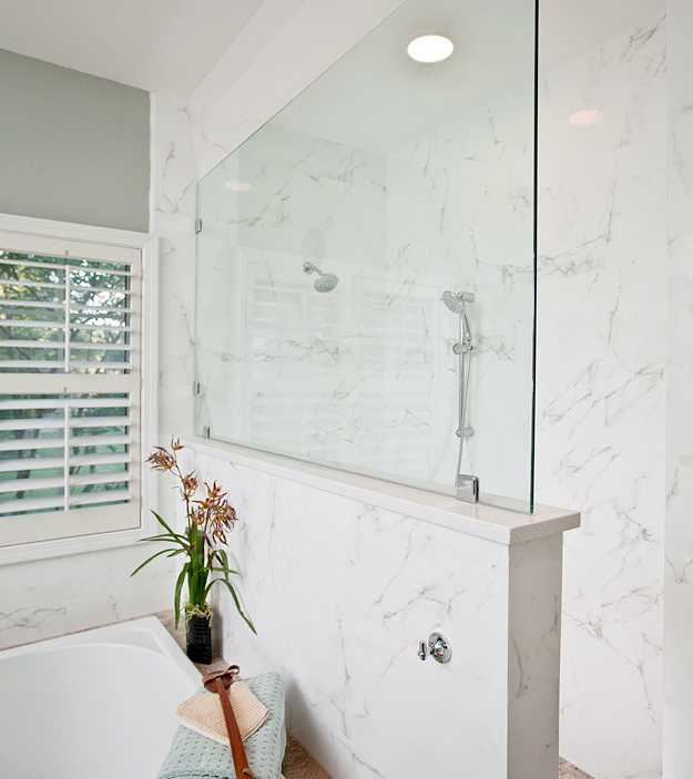
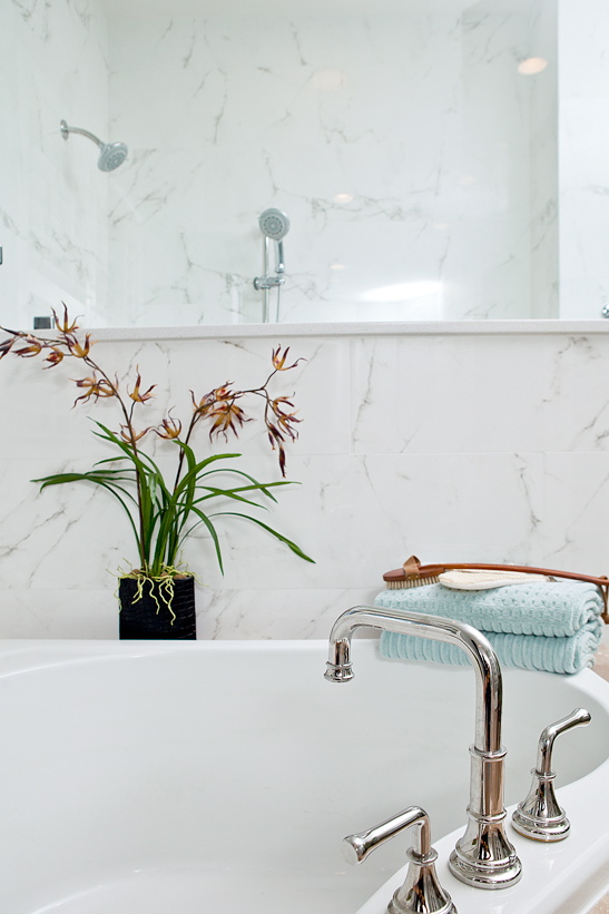
Much of this bath transformation came from simply the “de-construction” we performed! The earthy tones were just what the client was looking for and in the style of the overall house, worked really well now….and for future resell. This bath is now light and airy and has a tranquilty that was missing before. (along with any style or personality too!)



3 Responses
Wow, what a difference. Just for the sheer hell of it, I took my time with this blog and went through it a step at a time. I even went so far as to print out the two floor plans and put them side-by-side. Not until then did I move down and look at the pictures of the new bathroom. To which my response was, “holy smokes!” I think, at one time, the design of the original bathroom made some kind of sense. Maybe. But what you did with it is so much better than what was, that one leaves with the impression that the original design never made any sense at any time! It’s like the Chopin Prelude I’m listening to as I write these lines: perfect composition perfectly realized.
Beautiful work Cheryl, as usual. The colors and materials look so perfect for your Florida climate.
What a beautiful transformation! All the finishes are gorgeous. Great job.