A few of my ‘just say no’ kitchen design mistakes- I rarely see these mentioned so going to just put it out there!
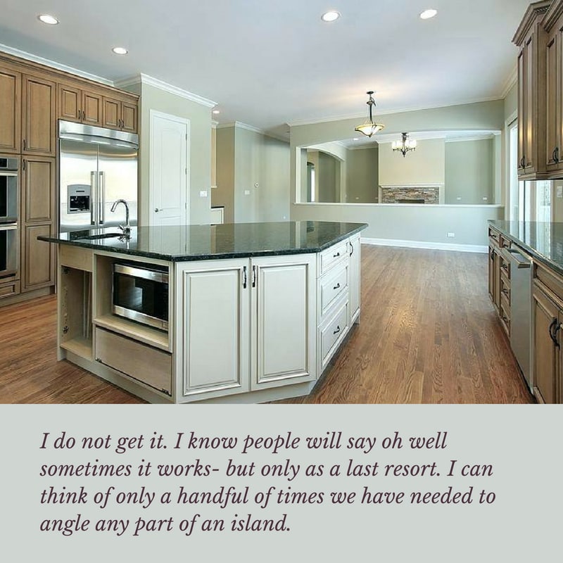
Multiple angled islands interesting or obstacle course?
Kitchen design mistake #1
Ok so just the other day I received a lovely advertising package for a new condo high rise with the most horrible flattened hexagon shaped island- for a cool 3million plus. I died. Maybe is just a show kitchen. I cannot bear to even post the plan because so much of it is beautiful- but the flat hex island is no bueno. I know sometimes it is necessary to cut a corner here and there and we have done it too- but is a top thing to avoid when you can do so- and always with a light hand. Think curvier than chamfered when possible and remember just how many laps you will do around an island like this and your hip bones will thank you too!
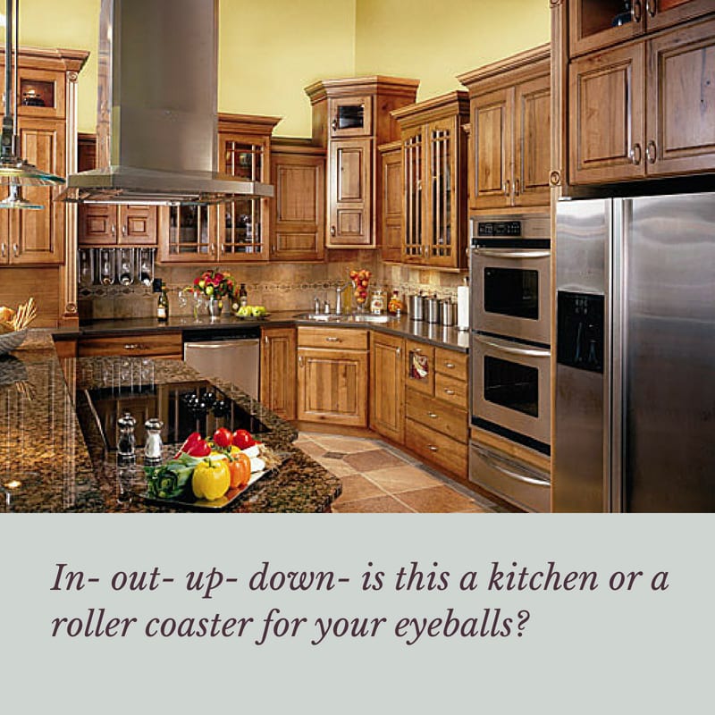
High-low cabinets – not for the attention deficit folks!
Kitchen design mistake #2
Just today heard a few people commenting on this and was a bit surprised that so many thought this was an ok idea. That is ok- but there is no good reason I can see to do this at least in the typical manner of a straight run going higher to just vary it for no real reason. Sure mid level cabinets full height can be cool and done well by good designers but the idea below is a big NO in my book. This came about from big box retailers trying to easily make their non custom cabinetry look custom. They are not fooling anyone.
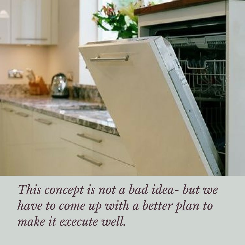
Raised Dishwashers
Kitchen design mistake #3
Raised dishwashers- I get the concept and why someone might think this is a good idea to save yur back-but Not for have yet to see a layout that works. The reason for this is simply because not only does it look weird as hell, it also is a major encumbrance right next to your sink! Who needs a 6 inch raised ledge right there? Now if the reason for raising is due to an ADA situation, we will do a work around that makes it work- but this “idea” died a while back and was even hard to find a photo to illustrate it!
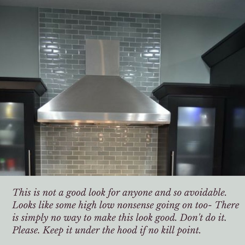
Tile creep- yes there can be too much of a good thing!
Kitchen design mistake #4
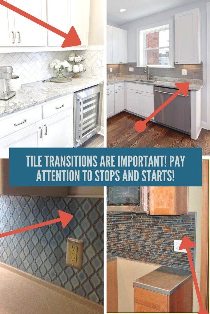
Oh lordy this one I see a lot and is an absolute no way in hell. Going above the hood with NO kill point is bad news. Tile transitions are a huge issue for us in any application and is one of the easy things to overlook for a diy-er or a novice designer. Heck it took me many years to hone these skills but just recently in Destin, we had cabinets taken out and redone because the plan was not followed and the tile ran short of the edge of the countertop. This is serious business for my team.
Do not sacrifice the knees at the counter or bar!
Kitchen design mistake #5
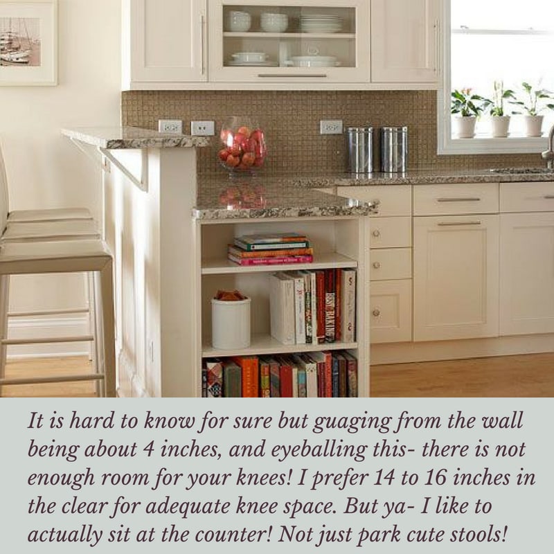
This is another commonly made mistake of developers of “bigasshighrises” – and for the life of me cannot understand it. If you do not have room for a few more inches- well then redesign the space. Call me ya’ll- I can fix any layout- but sadly developers rarely get expert advice and it is so ridiculous for the price being paid for these units. Living on the coast- I see way too much poor design in high rises- why? Maybe they simply do not care or they are not paying top dollar for the Architectural design- who knows. The kitchen below is cute enough- but why even put stools there when you cannot sit? Regardless of your kitchen layout be kind to yourself and family- allow room for your legs!
No ventilation- zomg. This is a big deal!
Kitchen design mistake #6
Ventilation is key to removing toxins and grease from your kitchen. It is not healthy to have a non ventilated kitchen. Period. Unless your idea of cooking is calling for take out! The best ventilation is an updraft with an internal, inline or remote blower. Be careful on the coast as remote blowers can have a lot of rust quickly and if that flapper gets stuck and your home is cold and the air outside is hot- well, lets just say you may think you have a faucet running from your hood! Condensation can be a big deal. Been there done that!
No picture because well- how can I show toxins and grease?
Tile transitions- it matters!
Kitchen design mistake #7
This is a huge element of design in my opinion and am again shocked at how many beautiful kitchens are ruined by a lack of communication between designer ( or contractor/homeowner if no designer) and the various trades who execute a kitchen- and their must be communication or the project is doomed from the start. Often the contractor is too busy to pay attention to these sorts of problems and they can ruin a beautiful project. These examples below are from just typical remodels showing tile transitions and terminations gone very very wrong- but even on a budget, there is no reason why these mistakes must be made!
Think of aging in place and also safety when working in the kitchen! No hinged microwaves under the counter!
Kitchen design mistake #8
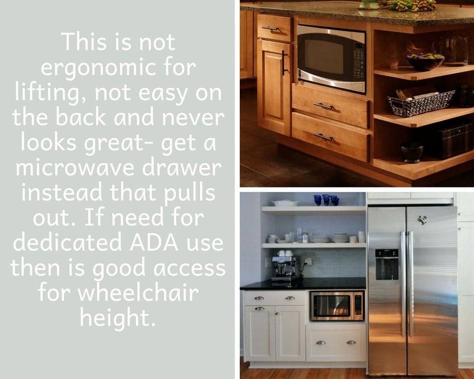
Microwave drawers are great- they pull out. We have done many times. But putting a microwave with a door hinging is not wise under a countertop- if no else to place- call me. I can help reconfigure the kitchen to make it work. It just is too much bending to lift out or even look inside-and not ergonomic at all. I can see doing this in an ADA kitchen if dedicated to that person. But that is it. And before anyone says oh but you are not worried about bending with dishwashers- there are also dish drawers for those who have a need to limit bending- one on each side of sink right under counter will work great!
What else is a serious NO WAY to you? I want to hear what you have learned! This old dog can always learn new tricks! I have a few more but some are more design aesthetic than an absolute. Now on to bathrooms!
Happy remodeling!
![]()




18 Responses
A very well written blog. These are the mistakes that we commonly tend to make. An angles island is definitely a big no. Looking forward to reading more from you.
Thank you!
Great tips – I will be sharing with my redesign clients in France!
Wow that is great!!
Hii.
A very well written blog. I am Looking forward to reading more from you.
This is amazing! I love how it turned out. You did a great job. Thanks for the sharing this
Great things to not do. Tile transition is a huge one for me.
Read the post, it’s really amazing to have a blog like this on kitchen design, while helpful for kitchen design companies like alkitchens, thanks for the post.
These are really common mistakes easily get ignored.. But important…
It’s very useful to me. I will share my husband. Thanks for sharing.
Those high-low cabinets just look cluttered and busy, like they’re all an afterthought. Thanks for including them in your list! Great info.
My sister is planning to remodel the kitchen and have custom cabinets for convenience and design. It was mentioned here that she should consider the height of the cabinets and not sacrifice hurting her knees for design. Furthermore, it’s recommended to go to trusted businesses when in need of quality custom cabinet design services.
Amazing!! That’s a great Information provided by you and it’s a common mistake that is done by anyone. But, while searching for best kitchen cabinet design ideas online I found Wooden Street as they have amazing furniture designs crafted with durable solid wood, perfect dimensions and best design ideas.
This is also a very good post which I really enjoyed reading. It is not every day that I have the possibility to see something like this..
Ok yes hood with no kill point looks super weird but i kinda liked that hexagonal shaped counter in the middle of the kitchen. looks good!
Haha some of these are just too funny! I really hope the home owners were able to catch this post and get all that stuff fixed up! I sure would lol!
There are SOOO many people with kitchens that have a terrible design and lay out.. these are so common!
Reading about it makes you realize about your mistakes. Thanks for sharing this amazing post