Choosing the right color of paint for your walls, or for that matter your cabinetry, bed linens, accessories…can be daunting to many people. This is one area I constantly find clients throwing up their hands in frustration.
Like any designer, I have my tried and true favorites and a few “go to” colors for various situations but I approach each project with no preconceived colors that are my “signature” colors like many designers I know.
Every job has different furnishing parameters, every home has different lighting (natural and interior) and every client has a different “color personality”.
But the idea that beige is a “neutral” needs to go away – it is not. In fact, the fleshy tones of beige are much harder to work into a harmonious palette for your furnishings too.

There is definitely a science to color and how colors interact with one another as well as how the eye sees color, but in my opinion, choosing the right color for each situation is more art than science (read more about that in my article here).
Except that now science seems to be cashing in on the beige train! Read more here about the discoveries of obesity fighting “beige fat”. I mean, come on. Perhaps really drab offices of most researchers is to blame for this!
Another attempt to thwart the abolition of beige, now even the cosmos is apparently beige, I wanted to think this was fake news but read it in too many places! Check out this article about the theory of the beige cosmos!

**ALWAYS look at the color swatch against pure white. The white will help you “see” the undertones much easier.
**BUY samples. Simple as that. You must. Because what is good at Susie’s house may look like crap at your house. You will most likely have different utilization of windows, different siting of your home which means different natural light at different times of day. Samples are far cheaper than having the painter redo a mistake!
**Paint samples on SHEETROCK if possible. Lowe’s sells 24×24 samples. Then you can place these around the room (or rooms) and at different times of day to get the real effect.
**IF you have your painter put them on the wall, DO NOT put them side by side. Novice mistake. Your eye will “see” the other color next to each other and it will influence the way it looks. At the very least, put them on opposite walls.
**Do NOT think that you can match a Benjamin Moore color or Pratt and Lambert color or any manufacturer color to another paint company. You may get lucky and it will be ok but more often, it does not look the same and high probability that the undertones could be seriously different and you will not know until it is on the wall. Just do not do it.
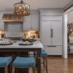
**PAINT YOUR TRIM (moldings, door casing, crown etc) WHITE or off white. 90 percent of the time this is the best call to make. If you are doing cool colors, use a cool white with hint of gray. If you are using warm colors then use a white that has a hint of yellow. Painting the walls and trim the same color can work- but is not easy to pull off in most rooms- if you like this look then try it in a dining room or guest room where you might not tire of it.
**Paint your CEILING A COLOR when appropriate. If you have crown to separate it, consider it appropriate! It can be a softer tint of the wall color or a contrasting color. It is a tricky thing but the results can be magical!
**Do NOT paint your walls beige. I repeat, do not paint your walls beige. Beige is ugly. There is no way to soften the blow. And beige with fleshy undertones is a SIN against nature man, and I think religious deities everywhere, because FLESHY COLORS do not belong on walls. Enough said.
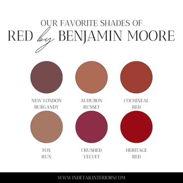
These are our no fail greige colors that work almost anywhere! Editor’s note: We liked Manchester Tan when this was originally written and it is still a good one if you MUST have a beige-ish color but try these for a fresh look in the new year!

You may also be saying to yourself…well if she does this all the time, what are her favorite colors? THIS WEEK, because it changes every week.
How do you break it to someone their house is just one big beige box? Read about it here!
![]()


Comments
Thank you for approving Manchester Tan because it is what I used for my bedroom in an attempt to not paint every room in my house a shade of blue or green. I’m not sure I love it but it’s definitely better than the peachy-fleshy color w/ poo brown accent wall that was there when I moved in.
My whole house is painted in Manchester tan. I was covering over the ugly pink beige walls. I chose manchester tan because of the splotchy gray/tan tiles that are all over this house… Gaaack. Eventually, (read someday in the far future) I will be taking out the ugly floors and putting wood down.. I love white, but in this house it’s just makes my floors look DIRTY.That said Manchester Tan is a beautiful color if there is a lot of light in the room.
I am planning on using Manchester Tan walls with White Dove trim but need some advice on what countertop to use in the kitchen and floor tile to make the colors work…any advice?
What color are the cabinets? How high is the ceiling? Man tan goes with almost anything tho!
I’ve got beige floors and need help finding the right neutral color for the walls. I’m working with white trim and ceiling. I thought about Shaker Beige – Ben Moore. Furniture is dark woods, brown leather couch, linen tan chairs, lots of light in the room… Would love your advice on a wall color. Thanks!
I could not disagree with you more about white trim. Believe me, there is a whole world of hues and tones for trim and white is not one of them unless the walls are white or light. Those outlines everyone loves because they look so clean and fresh are like putting piping around the lapel of every jacket or shirt in the closet! Once you get into toned trim or painted out trim or trim a shade deeper than the wall or taupe trim on dark colours, you will wonder why you ever thought white was the be all and end all. Let clean and fresh give way to elegant, sophisticated, quiet, and gorgeous as descriptors. [ I do live in Toronto so maybe the cooler, greyer climate means less trim punch or contrast works better here.] Apart from that, good on you for encouraging more bravery. Beige is the colour of fear in decor. Cheers. Janice
Thanks for the comments! But I respectfully disagree. In general I prefer white or a shade of off white. I agree that for more drama, painting trim a subtle shade of wall color can be striking. But I feel trim should be a lighter and neutral shade such as some form of white. It unifies the home.
I chose Elmira white over Manchester tan for our bedroom. It definitely looks grayer than I wanted. Our carpet is neutral and our furniture is antiqued with wood stained tops. I don’t want to repaint but need advice re colours of bedding to make this appealing. Do I add tan or gray accents
Gosh did not see this! I would go with gray accents with Elmira white!
Comments are closed.